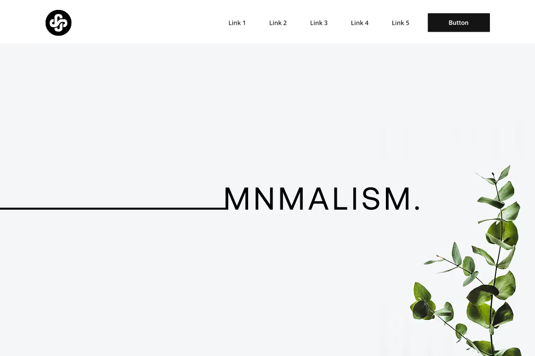
The Power of Simple Design: Why Less Is More in UX
You know that feeling when you open an app and everything just makes sense? You don't have to hunt for buttons, read lengthy instructions, or wonder what to do next. That's the magic of simple design at work. In a world where users are bombarded with information and choices, simplicity isn't just nice to have. It's essential for good UX design.
The truth is, when we strip away the unnecessary and focus on what really matters, we create experiences that people actually want to use. Let's explore why keeping things simple is one of the most powerful tools in a designer's toolkit.
Why Simple Design Actually Works Better
There's solid science behind why simple design creates better user experiences. According to the Nielsen Norman Group, a minimalist design is one that limits the amount of "noise" an interface has in order to emphasize necessary information, seeking to simplify interfaces by removing unnecessary elements or content that does not support user tasks.
When we remove clutter from interfaces, something interesting happens. Users can focus on what they actually came to do. Their brains don't have to work overtime filtering out distractions. UXmatters research shows that prioritizing essential features, reducing visual clutter, and making navigation easy to use creates interfaces that aren't just aesthetically pleasing. They're functional and purposeful.
This is exactly what we focus on at Wauu! Creative when working on UI/UX design projects. We don't just make things look pretty. We make them work better by removing everything that doesn't serve the user's goals.
Think about the apps you use most often. Instagram, Spotify, or even your banking app. The successful ones don't try to show you everything at once. They present information in digestible chunks and guide you naturally through your tasks. That's not accidental. It's the result of deliberate simple design choices.
The Numbers That Prove Simple Design Pays Off
If intuition isn't enough to convince you, the data makes an overwhelming case.
According to Forrester Research, a well-thought-out, frictionless UX design can raise conversion rates by up to 400%, and every dollar invested in UX returns approximately $100, representing a 9,900% ROI. These aren't marginal gains. They're transformative business outcomes driven by design decisions.
First impressions happen fast. Users form an opinion about a website within just 50 milliseconds, and nearly 94% of those impressions are based on design alone. That's less time than it takes to blink. In that window, a cluttered or confusing interface signals unreliability, while a clean and focused one signals professionalism and trust.
The cost of getting it wrong is equally significant. 88% of users won't return to a website after a poor experience, and 52% of US consumers have walked away from a purchase because of bad UX. That's not just a design problem. It's a revenue problem.
A poorly executed UX can ultimately cost 10 times more through customer loss and redevelopment effort than investing in a well-designed experience from the start. Simplicity, approached strategically, is one of the most cost-effective investments a business can make.
The Real Benefits Users Actually Notice
When you simplify your UX design, users notice the difference immediately. But what exactly are they experiencing?
According to LinkedIn research, minimalist UI/UX design helps users navigate and interact with interfaces more easily. By keeping minimal design elements, it enables the communication of information effectively and clearly to users.
They complete tasks faster. When there are fewer distractions and clearer paths, people spend less time figuring out what to do and more time actually doing it. A client of ours saw their checkout completion rate jump by 40% after we simplified their e-commerce flow by removing unnecessary form fields and streamlining the process. Baymard Institute's research backs this up: the average e-commerce checkout contains 23 form elements, but most sites can cut this by 20 to 60%, resulting in a 35% average increase in conversion rates.
They make fewer mistakes. Complex interfaces with too many options lead to user errors. Simple design reduces cognitive load, which means users can focus on their goals instead of trying to decode your interface. It's like the difference between trying to read a map with 50 different route options versus one with just the best path highlighted.
They feel more confident using your product. When everything is clear and predictable, users develop trust in your interface. They're not worried about clicking the wrong button or getting lost in confusing navigation. This confidence translates directly into better user satisfaction and retention. Improving UX design to increase customer retention by just 5% can translate to a 25% rise in profit.
Our UI/UX design approach at Wauu! Creative always starts with understanding what users actually need to accomplish, then designing the simplest path to get them there.
How to Actually Simplify Without Losing Function
Here's where many designers get stuck. They think simplifying means removing features or making things boring. That's not true at all. According to Toptal's UX research, minimal UX design is about prioritizing the interface features and content your users need to achieve their goals, such as deciding what to buy, where to open a bank account, or where to make a medical appointment.
Start with Your Content Hierarchy
What's the most important thing users need to see first? What can wait until they're deeper in the experience? Map this out before you open a design tool. When you're clear on the hierarchy of information, every layout decision becomes easier and more intentional.
Recent UX design principles emphasize that successful designers focus on user-centered design, accessibility, simplicity, consistency, feedback, mobile-first design, performance, personalization, emotional design, and data-driven decisions. That's a long list, but notice that simplicity and user-centered thinking come before aesthetics or trends.
Use White Space Strategically
Empty space isn't wasted space. It's breathing room that helps users process information. When elements have room to breathe, the important stuff stands out naturally. Think of white space as a spotlight that draws attention to what matters most.
The temptation when designing interfaces is to fill every available pixel. Resist it. A page that feels airy and uncluttered isn't one that lacks content. It's one where every element has been deliberately placed and given room to communicate.
Organize Information Logically
Group related items together and separate different concepts. This follows basic principles of how our brains process information. When things that belong together are placed together, users understand relationships without having to think about it.
This is sometimes called "chunking," and it's one of the most reliable patterns in UX design. Navigation menus that group related pages, forms that cluster related fields, and dashboards that separate distinct data types all benefit from this principle.
Choose Your Words Carefully
Clear, simple language beats technical jargon every time. If you need three words to explain something, don't use ten. Using a specific, clear call to action can increase conversion rates by 161%. Users scan more than they read, so make every word count.
This extends beyond button labels and headlines. Error messages, onboarding instructions, empty states, and tooltips all benefit from simple, direct language. When users encounter an error and the message explains clearly what happened and what to do next, they recover quickly instead of abandoning the task.
Simple Design and Accessibility: Two Sides of the Same Coin
One of the most important and often overlooked benefits of simple design is that it naturally creates more accessible interfaces. When you reduce visual noise, increase contrast, use legible type sizes, and create clear navigation patterns, you're not just helping the average user. You're making your product usable for the approximately 1.3 billion people worldwide who live with some form of disability.
Businesses lose $6.9 billion annually due to inaccessible websites, and 71% of users with disabilities leave sites that are hard for them to navigate. These aren't edge cases. They're real users and real revenue.
Accessible websites improve conversion rates by 35% and companies with accessible websites see a 15% increase in customer satisfaction overall. The case for accessible design is both ethical and commercial, and simple design is its natural foundation.
At Wauu! Creative, accessibility is built into our design and development process from the beginning, not added as an afterthought. This means products that work better for every user, not just those without disabilities.
Making Simplicity Work for Your Specific Users
The key to successful simple design isn't following a one-size-fits-all approach. It's understanding your specific users and what simplicity means to them. What feels simple to a tech-savvy user might feel confusing or barren to someone less comfortable with digital interfaces.
Uitop's design research points out that minimalism is one of the hottest trends in digital interface design, but warns that it needs to be implemented thoughtfully based on user needs rather than just following trends.
Start by watching how people actually use your current interface. Where do they hesitate? What questions do they ask? Those friction points are usually places where things could be simpler. We use this approach with all our clients, observing real user behavior before making design decisions.
Test your simplifications with real users. What feels obvious to you as the designer might not be obvious to someone seeing it for the first time. Simple design should feel natural, not empty or confusing. If users are asking "where did everything go?" you've probably gone too far.
Remember that simplicity can look different across different parts of your product. A dashboard for power users might need more visible controls than a landing page for first-time visitors. The goal isn't to make everything minimal. It's to make everything as simple as possible for its specific purpose and specific audience.
Simple Design in Practice: What It Looks Like Across Platforms
Simple design principles apply across every digital context, but the application differs depending on where users encounter your brand.
On your website, simplicity means a clear visual hierarchy, an obvious primary action on every page, navigation that doesn't require exploration to understand, and a mobile experience that works as well as the desktop version. If someone lands on your homepage and can't immediately understand what you do and how to contact you, the design has work to do.
In web applications and dashboards, simplicity means surfacing the most frequently used features prominently, hiding advanced functionality behind clearly labeled secondary navigation, and reducing the number of decisions a user has to make to complete a common task.
In ecommerce, simplicity means a checkout flow with as few steps and fields as necessary, clear product information, prominent trust signals, and a recovery path for common errors. The average large e-commerce site can increase its conversion rate by 35.26% simply by redesigning its checkout process. That's not a small optimization. For a business doing significant online revenue, that's transformational.
Whether your project is a marketing site, a web application, or a customer portal, the development approach matters as much as the design. Simple design delivered through a flexible, performant platform creates experiences that hold up over time. Simple design bolted onto a slow or rigid platform eventually creates its own friction.
The Connection Between Simple Design and Business Growth
There's a pattern across the businesses that invest in good UX design. Their products are easier to use, yes, but the downstream effects go much further.
Design-led companies outperformed the S&P 500 index by 228% over a ten-year period. Companies that prioritize UX see 32% more revenue growth and 56% higher total shareholder returns over five years compared to their peers. These aren't correlations to dismiss. They reflect a genuine competitive advantage that compounds over time.
The mechanism is straightforward. Simple, well-designed products get used more. Products that get used more retain users longer. Retained users spend more, refer more, and require less support. Less support means lower operational costs. Lower costs combined with higher revenue equals sustainable growth.
Improving customer retention by just 5% through better UX can increase profit by 25%. At the same time, a 10% increase in UX investment can drive conversion rates up by as much as 83%. The investment case for simple, user-centered design is clear.
Common Mistakes That Complicate UX Unnecessarily
Understanding good practice matters, but so does recognizing what works against simplicity. Here are the patterns we see most often in interfaces that frustrate users.
Too many calls to action competing for attention. When everything is emphasized, nothing is. Every page should have one clear primary action, with secondary actions clearly subordinate to it.
Navigation designed for the business, not the user. Site structures that mirror internal team structures or product categories often make sense to the people who built them, but create confusion for visitors who don't share that mental model. Navigation should be organized around what users are trying to do.
Forms that ask for more than they need. 68% of users won't submit a form if it requires too much personal information. Every field you add creates friction. Before adding a field, ask: do we actually need this information right now, or can we collect it later?
Error messages that explain nothing. "Something went wrong" tells a user nothing useful. A simple, specific error message that explains what happened and what to do next recovers users from mistakes and reduces abandonment.
Animations that delay rather than delight. Motion can add personality and guide attention, but transitions that take too long or play every time a user performs a common action become annoying rather than impressive. Animation should serve the user's flow, not interrupt it.
Building for Tomorrow, Starting with Simplicity Today
Simple design isn't just a current best practice. It's the right foundation for what comes next.
AI-driven personalization can increase engagement by 80%, and voice search now accounts for approximately 27% of all searches. Both of these trends reward simplicity. Personalization works best when the underlying interface is clean enough that tailored content stands out clearly. Voice interfaces are the ultimate expression of simple design, stripped of visual UI entirely and relying purely on clear, logical content hierarchy.
The businesses that will adapt most successfully to these shifts are those that have already committed to user-centered, simple design thinking. The habit of stripping away the unnecessary, testing with real users, and measuring the impact of design decisions is the foundation that makes future adaptation possible.
Simple design isn't about having less. It's about having exactly what you need, when you need it, in the clearest way possible. When you get that balance right, users don't just complete their tasks. They enjoy the experience of doing so.
Ready to simplify your user experience? Our team at Wauu! Creative specializes in UI/UX design that removes friction, increases conversions, and creates digital experiences people genuinely enjoy using. Let's talk about your project.


(1)-min.avif)


