The short answer: a standout visual identity combines a distinctive logo, deliberate color psychology, cohesive typography, and consistent application across every touchpoint. No single element makes a brand memorable. It's the system working together that does.
In today's crowded marketplace, every business is fighting for attention. Some brands just stick with you. When you see that swoosh, you instantly think Nike. When you spot the bitten apple, Apple comes to mind before the word is formed. That's the power of a strong visual identity. But what exactly makes some identities unforgettable while others fade into the background? Let's dig into the elements that separate the memorable from the forgettable.
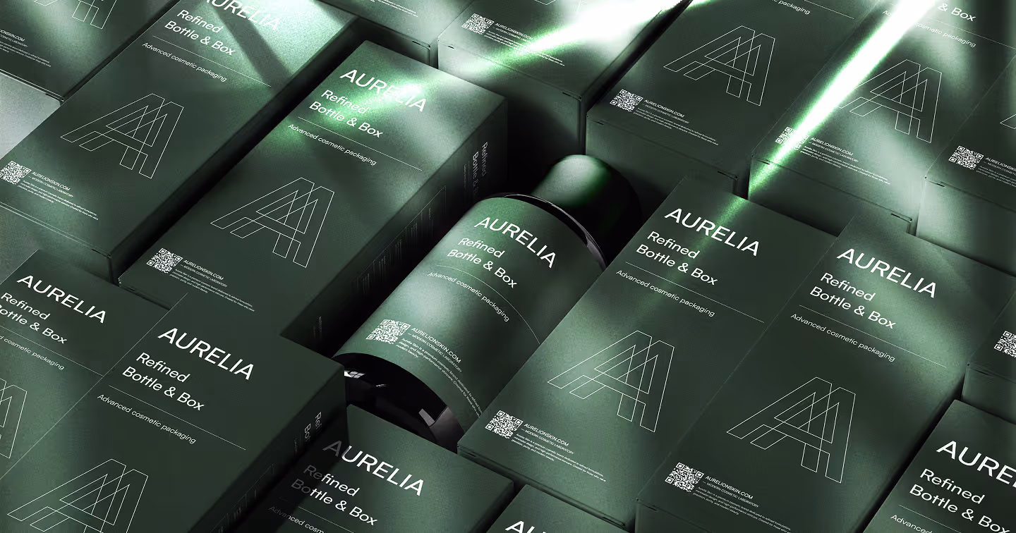
The Foundation: A Visual Identity Is a System, Not a Logo
A standout visual identity isn't just about making things look nice. It's a complete system that tells your brand story without saying a word. Most businesses get this wrong by treating their identity as a collection of assets rather than a cohesive whole.
As Brand Master Academy explains, visual identity encompasses all the visible elements of a brand that shape how it is perceived — everything from logos and color schemes to typography and imagery works together to create a cohesive brand experience. The moment any element drifts out of sync, the whole system weakens.
At Wauu! Creative, we see this daily when working with clients on their branding projects. We don't just deliver a logo. We pay attention to the small details and make sure everything feels right, creating comprehensive visual systems that truly represent each client's brand.
Think of your visual identity as your brand's personality made visible. Every color choice, every font selection, every image style should work together to communicate who you are and what you stand for. When a visitor encounters your brand on Instagram, your website, or a business card, they should immediately recognize it as yours without needing to read your name. That instant recognition is built through consistency, not luck.
This is exactly why we create detailed brand guidelines for every client. A guideline document isn't bureaucracy. It's the rulebook that keeps your identity intact as your team grows, your channels multiply, and time passes.
The Psychology of Color: More Than a Preference
Color is the fastest-working element in any visual identity. Before a visitor reads your headline or understands your offer, they've already formed an emotional impression based on the colors on the page.
According to Stripe's branding guide, colors evoke emotions and have psychological effects — brands choose colors that reflect their identity and influence how they are perceived. This isn't abstract theory. It's the reason why most financial institutions lean on blue (trust, stability), why fast food chains favour red and yellow (urgency, appetite), and why wellness brands gravitate toward green and soft earth tones (calm, health, growth).
The brands that stand out don't pick colors they like. They pick colors that make their specific audience feel something specific. Red creates urgency and excitement. Blue builds trust and reliability. Green suggests growth and harmony. Purple signals creativity and premium quality. Black communicates authority and sophistication.
You can see this strategic thinking in our work with Greatpoint, where we carefully selected blue and bronze to reflect the company's brand values and connect credibly with their professional audience. Neither color was arbitrary. Both serve a precise psychological purpose.
The rule is simple but often ignored: your color choices must align with your brand personality and your audience's expectations, not your personal preferences. A mismatch between color and brand personality creates a subtle but real sense of wrongness that users feel even if they can't articulate it. We cover this in more depth in our article on common visual mistakes that kill trust.
Typography: The Voice Behind the Words
Typography communicates personality before a single word is read. The typeface you choose signals whether you're playful or serious, modern or traditional, approachable or authoritative.
A tech startup using Comic Sans would feel instantly wrong. A children's toy company using stark, angular fonts would miss the mark entirely. These aren't arbitrary aesthetic judgments. They're failures of brand-personality alignment that erode trust at a subconscious level.
Bold, expressive typography has dominated design in recent years, with brands pushing boundaries to create text that commands attention. But bold isn't always right. The question isn't which typeface is trending. It's which typeface fits your brand's voice and serves your reader's ability to absorb your content.
A strong typographic system for a visual identity typically includes a primary typeface for headlines, a secondary for body text, and clear rules about sizing, weight, and spacing. That system, applied consistently, becomes part of how people recognize your brand even before they consciously register what they're seeing.
If you're unsure whether your current typography is working for or against you, our creative design services include visual audits that identify exactly these kinds of misalignments.
Authenticity and Evolution: Staying Real While Moving Forward
Consumers have become remarkably good at detecting when a brand feels fake. Recent design trend analysis consistently shows that authentic, personalized branding is increasingly important as people seek genuine and relatable brand experiences.
This doesn't mean your visual identity should look rough or unpolished. It means it should feel genuinely connected to what your business actually is and who the people behind it actually are. A brand identity built on a fabricated personality will always feel hollow, no matter how beautiful the execution.
This is central to how we approach every logo and branding project at Wauu! Creative. We start by understanding each client's real story, values, and audience before touching any design tool. The visual system we build reflects something true, not something invented for visual appeal.
At the same time, strong brands evolve. Apple's visual identity looks very different today than it did in the 1980s, but you can trace the same DNA of simplicity and clarity through every decade. The core hasn't changed. The expression has adapted to the times. That balance — staying true to your identity while evolving your expression — is exactly what we help clients navigate, whether they're building from scratch or working through a rebrand. Our piece on rebranding: what to keep and what to kill goes deeper on how to make that call.
The Details That Build Recognition Over Time
The brands people recognize instantly are almost never the result of a single strong logo. They're the result of hundreds of small, consistent decisions applied over time.
As branding experts at Gingersauce note, patterns, illustrations, photography, shapes — whatever you use in branding matters. All visual elements need to be structured and specifically designed for a particular business. This comprehensive approach ensures every element works together harmoniously rather than competing for attention.
In practice, this means thinking carefully about how your images are styled and cropped, what kinds of shapes and patterns appear across your materials, the mood and tone of your photography, how white space is used to create breathing room, and the personality of any graphic or illustrative elements you use. None of these are incidental. Each one contributes to the total impression your brand makes.
Coca-Cola has used the same red color and distinctive script for well over a century. That isn't stubbornness or lack of imagination. It's the accumulated weight of consistent application building one of the most recognizable identities on the planet. Your brand won't need a century, but it does need consistency. Every deviation from your established system is a small withdrawal from the recognition bank you've been building.
Our team applies this same thinking to UI/UX design, ensuring every visual element on a digital product serves a clear purpose and contributes to a coherent overall experience rather than just filling space.
Emotional Connection: What Great Identities Actually Do
The visual identities that truly stand out make people feel something. They create an emotional connection that goes beyond the rational features of a product or service, and that connection is what drives loyalty, referrals, and long-term retention.
When someone encounters your visual identity, what emotion do you want them to feel? Excited? Trusted? Inspired? Reassured? Your visual choices need to be deliberately crafted to evoke that specific response in your specific audience. Generic design evokes generic feelings, which is to say, no lasting feeling at all.
This emotional dimension is also what makes visual identity so much more than a marketing consideration. It shapes how your team feels about the work they do, how partners perceive you in a room, and how clients decide whether to trust you with something that matters to them. A strong identity signals that you take your business seriously. A weak one signals the opposite, regardless of how good your actual product or service is.
We explore the specific ways visual mistakes undermine this emotional trust in our article on common visual mistakes that kill trust, which covers the design errors that quietly erode credibility before anyone reads a word.
Scalability: Designed to Work Everywhere
A beautiful visual identity that breaks down in real-world use won't stand out for the right reasons. Every element of your identity needs to be practical and flexible enough to work across all the contexts your brand appears in.
Your logo should look strong on a business card and on a billboard. Your color palette must work in print and on screens, in full color and in grayscale. Your typography needs to be readable at any size, on any background. These aren't edge cases. They're the everyday reality of how brands live in the world.
Designing for scalability also means thinking ahead. What happens when you add a product line? Expand to a new market? Launch a sub-brand? A well-constructed visual system has enough flexibility built into it to accommodate growth without losing coherence. A poorly constructed one forces a painful redesign every time the business evolves.
At Wauu! Creative, we ensure every asset is organized and developer-ready, enabling smooth transitions from design to implementation across both Webflow development and WordPress development projects. The handoff between design and build is where many identities lose fidelity. We close that gap by treating it as part of the design process, not an afterthought.
If you want to understand the full process of how a visual identity goes from concept to a finished brand system, our post on our branding design process walks through every stage from the first client conversation to final delivery.
Frequently Asked Questions
What is visual identity and why does it matter?
Visual identity is the complete set of visual elements that represent your brand: your logo, colors, typography, imagery style, patterns, and layout principles. It matters because it shapes how people perceive and feel about your business before they interact with it directly. A strong visual identity builds recognition and trust. A weak or inconsistent one erodes both.
What is the difference between visual identity and branding?
Branding is the broader strategy that defines what your business stands for, how it sounds, and how it makes people feel. Visual identity is the visible expression of that strategy. Think of branding as the personality and visual identity as the appearance. The two need to be aligned, but they aren't the same thing.
How many colors should a brand visual identity have?
Most effective visual identities use two to four colors: a primary color, one or two secondary colors, and a neutral. More than that creates visual noise and makes consistency harder to maintain. The right number depends on your brand personality and the contexts you operate in.
How do I know if my visual identity needs updating?
Key signals include: your brand looks inconsistent across channels, your design feels out of step with where your business is today, you're embarrassed to hand over a business card, or your competitors simply look more credible. If any of these apply, a professional brand review is a good starting point.
How long does it take to build a visual identity?
A thoughtful visual identity project typically takes four to eight weeks, depending on scope and the number of revision rounds. Rushing the process usually results in a system that needs to be redone within a year. Our branding process article explains what happens at each stage and why each step takes the time it does.
The Bottom Line
What makes a visual identity stand out isn't any single element. It's how all the pieces work together to create something cohesive, memorable, and emotionally resonant. It's about understanding your audience, staying true to your brand personality, and applying your visual elements with discipline across every touchpoint.
In a world where people are bombarded with visual information every day, the brands that stand out are the ones that speak clearly, consistently, and authentically. They understand that good design isn't just about looking impressive. It's about communicating effectively and creating lasting connections with the people who matter to their business.
Your visual identity is often the first impression people have of your brand. Make it count. If you're ready to create a visual identity that truly stands out, let's connect and talk about how we can bring your brand vision to life.