
You're scrolling through your phone and come across a website that looks absolutely stunning. The colors are perfect, the typography is on point, and every element seems to be in its ideal place. But then you try to actually use it, and everything falls apart. The navigation is confusing, you can't find what you're looking for and by the time you figure out how to complete a simple task, you're ready to give up entirely. In the end it feels like this website was only designed for a marketing stunt, not for use.
This is the classic case of putting aesthetics before user experience. While beautiful design certainly has its place, it's not enough on its own. In 2025, successful digital products need to go beyond just looking good, they need to work well for real people in real situations.
The Problem with Pretty-First Design
Here's the thing about design that only focuses on appearance: it misses the entire point of why digital products exist in the first place. Whether you're building a website, an ecommerce platform, or a mobile application, your primary goal should be helping users accomplish their tasks quickly and easily.
According to The Design Institute, "In 2024 and beyond, UX designers will need to embrace the complexities of human psychology and work harder to connect with their users on an emotional level. This will increasingly mark the difference between good and exceptional UX."
Think about some of the most successful digital products you use every day. Google's search page isn't winning any design awards, but it's incredibly effective at helping you find information. Amazon's interface might not be the prettiest, but it makes buying things ridiculously easy. These products succeed because they prioritize function alongside form.
What Makes Good UI/UX Design
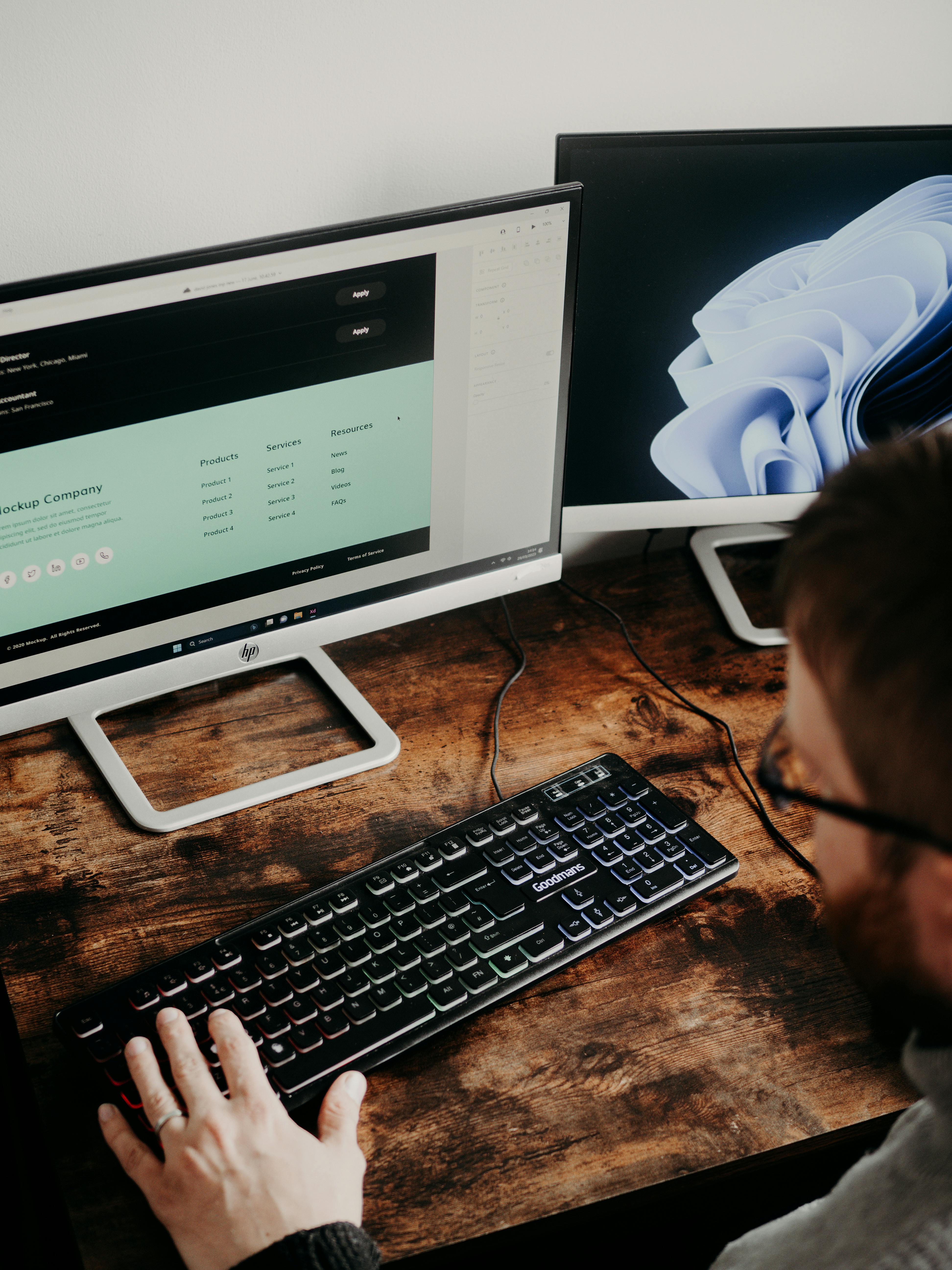
Good UI/UX design starts with understanding your users and their goals. It's about creating interfaces that feel intuitive, reduce cognitive load, and guide people naturally toward their objectives. This means paying attention to things like information hierarchy, navigation patterns, loading times and accessibility.
User experience encompasses every aspect of how someone interacts with your digital product. It includes the visual design, yes, but also the underlying structure, the flow between different sections, error handling, and even how quickly pages load. All of these elements work together to create an overall experience that's either delightful or frustrating.
UXPin's research shows that successful 2025 design trends focus on "AI in design, animated icons, cross platform UX". All elements that enhance usability rather than just appearance. This shift reflects a broader understanding that great design serves users first.
When we work on UI/UX projects at Wauu! Creative, we always start with user research and testing. We want to understand what people are actually trying to accomplish and what obstacles are getting in their way. Only then do we start thinking about colors, fonts, and visual elements.
The Human Element in Design
The best digital products feel human. They anticipate what users might need, provide helpful feedback when things go wrong, and make complex tasks feel simple. This is what we mean when we talk about design for human needs.
Consider how people actually use websites and applications. They're often distracted, in a hurry, or using devices with small screens. They might be accessing your site in bright sunlight, on a slow internet connection, or while multitasking. Good UX design accounts for all of these real-world conditions.
Duck Design emphasizes that "UX is important as it holds increasing relevance for businesses, playing a crucial role in how customers engage with and build trust in a brand and their products." This trust doesn't come from pretty pictures, it comes from consistent, reliable experiences that meet user expectations.
This human-centered approach is especially important for ecommerce sites and business applications. When someone is trying to make a purchase or complete a work task, they don't want to be impressed by your creativity, they want to get things done efficiently. The visual design should support this goal, not distract from it.
Building Products That Actually Work
Creating truly functional digital products requires a different mindset than creating digital art. It means making decisions based on user behavior data rather than personal preferences. It means testing interfaces with real users and iterating based on their feedback.
At Wauu! Creative, our approach combines strategic thinking with practical implementation. We create designs that focus on improving conversions, sharpening clarity, and strengthening credibility. This means every design choice serves a purpose beyond just looking good.
The most effective websites and applications have clear information hierarchies, intuitive navigation systems, and consistent interaction patterns. They load quickly, work well on different devices, and provide clear feedback when users take actions. These might seem like basic requirements, but they're often overlooked when teams focus too heavily on visual impact.
Wix's analysis of UX trends points out that "User experience (UX) design is a fascinating field that involves creating new products, apps, website designs and user interfaces. The goal of UX design is two-fold: First, to take care of new demands and provide users with the best experience when they interact with products."
The Balance Between Beauty and Function
This isn't to say that visual design doesn't matter. Beautiful interfaces can create positive emotional responses, build brand recognition, and make products more enjoyable to use. The key is finding the right balance between aesthetics and usability. Read our older post "What makes visual identity stand out" and learn more how to create a killer brand.
The best digital products are both beautiful and functional. They use visual hierarchy to guide users through complex information, employ color and typography to create mood and personality, and use white space and layout to reduce cognitive load. Every visual element serves both aesthetic and functional purposes.
When we work on projects like our Webflow development services, we're constantly balancing these considerations. We want the final product to look professional and engaging, but we also want it to convert visitors into customers and provide a smooth user experience across all devices.
The most successful approach is to start with user needs and business goals, then layer on visual design that supports those objectives. This ensures that your beautiful interface actually helps users accomplish their tasks rather than getting in their way.
Remember, your users aren't visiting your website to admire your design skills, they're there to find information, make purchases, or complete specific tasks. The best design is often invisible, smoothly guiding users toward their goals without drawing attention to itself.
In a world where people have countless digital options, the products that succeed are those that make users' lives easier, not just prettier. If you're ready to create digital experiences that truly serve your users, let's chat about how we can help you build something that works as well as it looks.