Bebubam
Bebubam myy äiti- ja vauvatuotteita kaikkialla Vietnamissa. Kymmeniä fyysisiä myymälöitä, kasvava verkkokauppa ja toiminta, joka skaalautui nopeammin kuin heidän työkalunsa pystyivät pysymään mukana.
Johdanto
Bebubam on vietnamilainen äiti- ja vauvatuotteita myyvä vähittäiskauppaketju, jolla on kymmeniä fyysisiä myymälöitä ympäri maata sekä keskitetty verkkokauppa. Ketju kasvoi nopeasti, ja halkeamat alkoivat näkyä. Varastoa seurattiin laskentataulukoilla, henkilöstöhallintoa yhdellä työkalulla, kirjanpitoa toisella, myyntitiedot hajautettiin myymälän kassajärjestelmän ja verkkokaupan välillä. Mikään järjestelmä ei kommunikoinut toisilleen.
BBS Ltd. kutsui meidät suunnittelemaan räätälöityä toiminnanohjausjärjestelmää, joka yhdistäisi kaiken, yhden alustan, jota heidän tiiminsä voisivat käyttää päivittäin ilman manuaalia tai IT-tutkintoa. Tuo viimeinen osa oli erittäin tärkeä.
Nopeasti kasvava, hitaasti rikkoutuva
Bebubamin tilanteessa hankalaa ei ollut se, että heillä oli yksi iso ongelma, vaan se, että heillä oli tusina pienempää, jotka kasaantuivat yhdeksi isoksi ongelmaksi. Varastotasoja täsmäytettiin manuaalisesti useiden varastojen välillä. Talous ja operatiivinen toiminta eivät tarkastelleet samoja lukuja. Myymälän henkilökunta ja pääkonttori työskentelivät täysin eri järjestelmissä, mikä tarkoitti, että päätökset olivat aina askeleen jäljessä todellisuudesta.
Kaiken lisäksi järjestelmää käyttävät ihmiset eivät olleet kehittäjiä tai tehokäyttäjiä. He olivat myymälähenkilökuntaa, varastotyöntekijöitä, kirjanpitäjiä ja johtajia, joilla jokaisella oli täysin erilaiset työnkulut, eri taso teknistä osaamista ja hyvin vähän sietokykyä hidastavaa järjestelmää kohtaan. Käyttökokemuksen pieleen jättäminen ei tarkoittanut vain turhautuneita käyttäjiä; se tarkoitti todellisia toiminnallisia virheitä, taloudellisia tappioita ja järjestelmää, jota kukaan ei todellisuudessa ottaisi käyttöön.
Haasteena oli suunnitella jotain, joka kykenisi käsittelemään vakavaa toiminnallista monimutkaisuutta ja tuntuisi silti riittävän helposti lähestyttävältä myymälätyöntekijälle kiireisenä lauantaina.
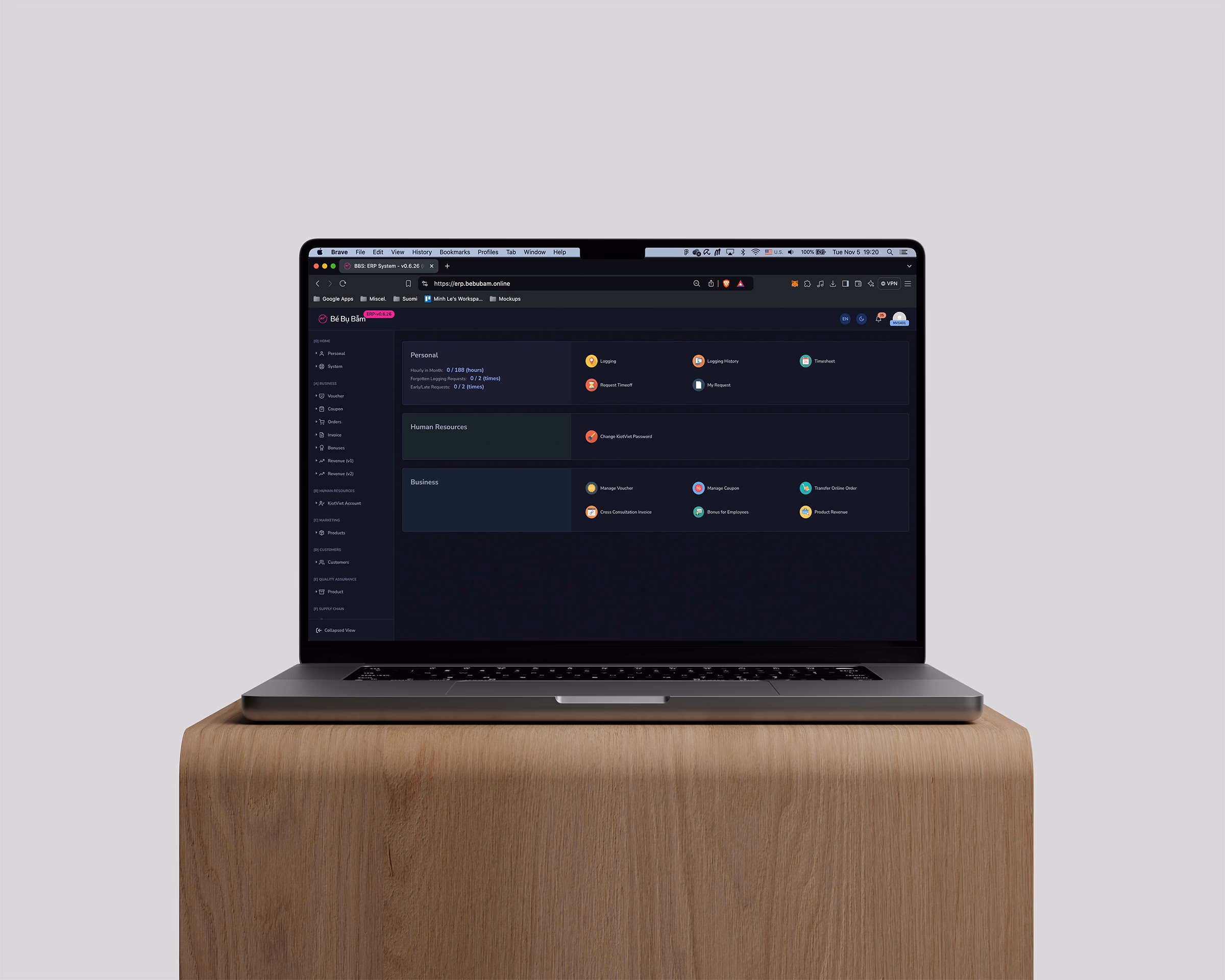
Yksi järjestelmä, rakennettu ihmisten todellisten työskentelytapojen ympärille
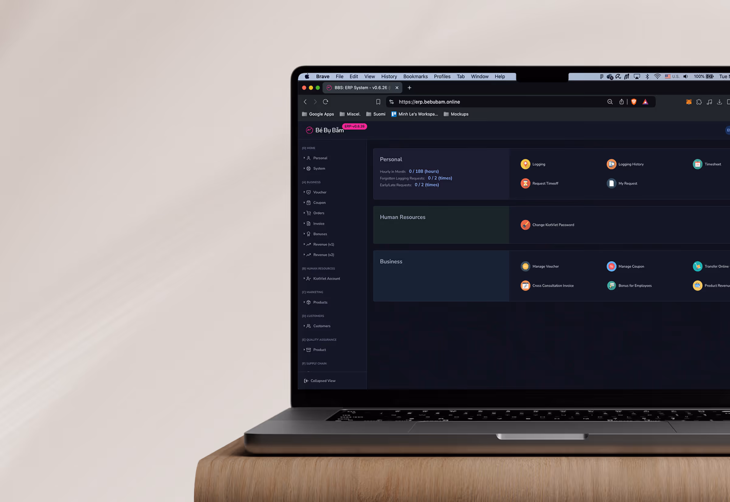
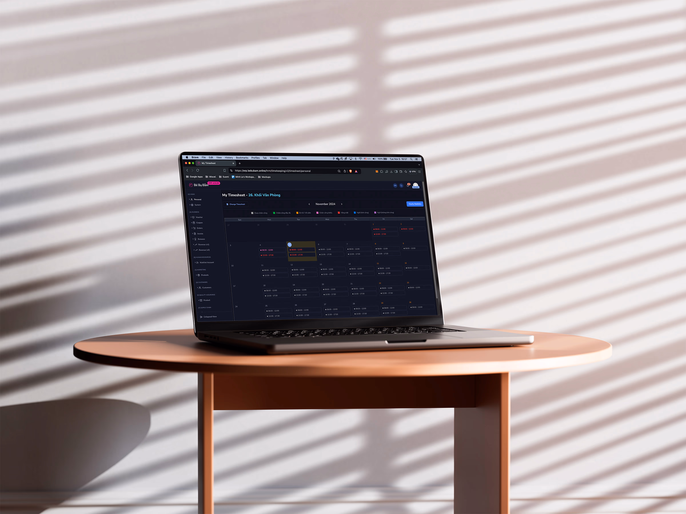
Ensimmäinen suuri päätös oli modulaarinen arkkitehtuuri. Yhden monoliittisen käyttöliittymän sijaan rakensimme toiminnanohjausjärjestelmän itsenäisiksi moduuleiksi: varastonhallinta, henkilöstöhallinto, asiakkuudenhallinta, kirjanpito, markkinointi, laadunvarmistus ja tilausten hallinta, jotka kaikki noudattivat samoja vuorovaikutusmalleja. Tämän etuna ei ollut pelkästään visuaalinen yhdenmukaisuus. Se tarkoitti myös sitä, että yhden moduulin oppiminen helpotti seuraavan moduulin oppimista. Uusien työntekijöiden perehdytys nopeutui, eikä ominaisuuksien lisääminen myöhemmin vaatinut koko järjestelmän uudelleensuunnittelua.
Rakensimme myös koko käyttöoikeusmallin itse käyttöliittymälogiikkaan. Varastonhoitaja ei näe taloushallinnon hyväksyntäprosessia. Myymälän työntekijä ei näe pääkonttoritason raportointia. Navigointi, kojelaudat ja käytettävissä olevat toiminnot muuttuvat sen mukaan, kuka on kirjautunut sisään, joten ihmiset käsittelevät vain heille olennaisia asioita. Kyse ei ollut pelkästään käyttöoikeuksien hallinnasta, vaan kognitiivisen kohinan vähentämisestä kaikille.
Varsinaisen käyttöliittymän suunnittelussa valitsimme tarkoituksella toiminnallisen. Tämä on ohjelmisto, jota ihmiset käyttävät tuntikausia yhtäjaksoisesti, joten raskas visuaalinen koristelu olisi ollut häiriötekijä. Pysyvä sivupalkin navigointi, kiinteät otsikot pitkille listoille, selkeät tilaindikaattorit ja yhdenmukaiset sivuasettelut kaikissa moduuleissa – päätöksiä, jotka eivät näytä näyttäviltä kuvakaappauksessa, mutta joilla on todellinen merkitys työpäivän kuudennella tunnilla. Jokainen tärkeä työnkulku on myös kartoitettu todellisten operatiivisten vaiheiden perusteella, ei sen perusteella, mikä näytti loogiselta valkotaululla.
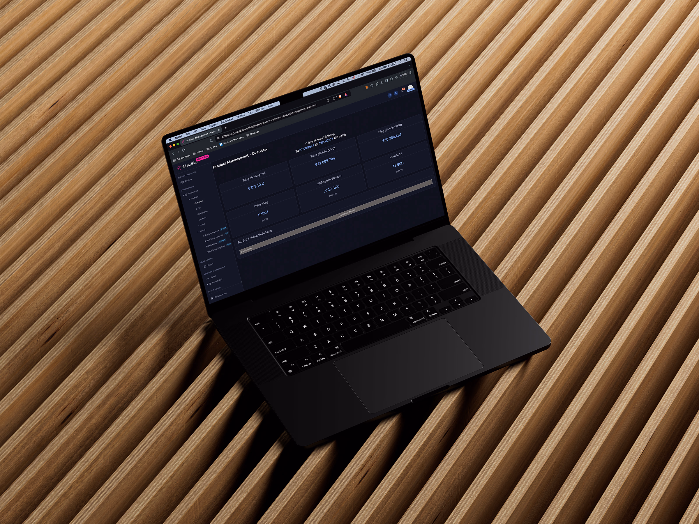
Otetaan esimerkiksi varastonhallinta: käyttäjä valitsee sijainnin, näkee reaaliaikaiset varastotasot, havaitsee alhaiset tai epäsuhdan, käynnistää siirron tai täydennyksen ja seuraa sitä hyväksynnän ja täydennyksen kautta, kaikki yhdessä paikassa, siinä järjestyksessä kuin he todellisuudessa ajattelisivat sitä. Käytimme sisäisiä toimintoja, vahvistustiloja ja edistymisindikaattoreita, jotta käyttäjät tiesivät joka vaiheessa tarkalleen, mitä he olivat tehneet, mitä järjestelmä käsitteli ja mitä seuraavaksi. Liiketoimintakriittiselle työkalulle tällainen palaute ei ole kiva saada.
Vähemmän virheitä, vähemmän koulutusta, enemmän luottamusta dataan
Käyttöönoton jälkeen luvut kertoivat melko selkeän tarinan. Yleiset inventaario- ja raportointitehtävät tehtiin noin 40 % nopeammin kuin ennen. Inventaariovirheet laskivat noin 60 %, pääasiassa siksi, että kaikki viimein katsoivat samaa reaaliaikaista dataa laskentataulukoiden vertailun sijaan. Uuden henkilöstön perehdytysaika lyheni noin 35 %, mikä on järkevää, kun käyttäjillä on roolikohtaisesti räätälöidyt käyttöliittymät sen sijaan, että heillä olisi valtava määrä ominaisuuksia, joihin he eivät koskaan koske.
Mutta jos ollaan rehellisiä niin Bebubamin tulevaisuuden kannalta tärkeintä on sen luoma perusta. Järjestelmä on suunniteltu kasvamaan heidän mukanaan, uusien myymälöiden sijaintien, uusien tuotekategorioiden ja uusien sääntelyvaatimusten myötä, ilman, että sitä tarvitsee rakentaa uudelleen joka kerta. He siirtyivät teipatuista työkaluista alustaan, joka on rakennettu heidän suuntaansa, ei vain sitä varten, missä he olivat.