
TL;DR
- A logo is a single visual mark. A brand identity is the complete system of visual elements that work together to represent your business consistently across every touchpoint.
- Having a logo but no brand identity is like having a signature but no personality. The mark exists, but there is nothing supporting it.
- Brand identity includes color palette, typography, imagery style, spacing, iconography, and the guidelines that keep everything consistent as your business grows.
- The reason this matters for your business is that consistency builds recognition, and recognition builds trust.
Most business owners think they are the same thing. They are not, and the confusion leads to a specific, common problem: you get a good logo, but your brand still looks inconsistent across your website, your social media, your proposals, and your email. Each asset looks slightly different, like it was made by different people at different times. Because it was.
A brand identity is what prevents that.
What a logo actually is
A logo is a visual mark that identifies your business. It is a symbol, a wordmark, or a combination of both that someone can see and associate with you. Nike's swoosh. Apple's apple. The Wauu! Creative mark.
A logo is important. It is often the first visual element someone encounters from your brand. But it is just a mark. On its own, it cannot carry the weight of representing your entire business across every context it appears in.
A logo in isolation does not tell you what colors to use on your website. It does not tell your social media manager what font to use in a post graphic. It does not tell your developer how much spacing should be between sections. Without answers to those questions, every person who produces something for your brand makes their own choices, and those choices add up to an inconsistent, fragmented visual presence.
What a brand identity actually is
A brand identity is a designed system that answers all of those questions in advance.
It starts with the logo in all its required variations: full color, reversed (white on dark), monochrome, and any simplified versions needed for small formats like favicons or embroidery. But that is just the beginning.
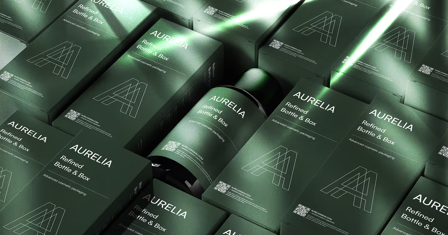
A complete brand identity includes a defined color palette with primary, secondary, and neutral colors, and guidance on when and how each is used. It includes a typography system specifying which fonts to use for headings, subheadings, body copy, and interface elements, with sizing and weight guidelines. It includes imagery direction: what kinds of photography and illustration are on-brand and what is not. It includes spacing and layout principles that create visual consistency across different formats. And it includes a brand guidelines document that captures all of these decisions so anyone working on your brand, whether internal team members or external suppliers, can apply them correctly.
Without these elements, the logo you paid for will look slightly different in every context. Someone will pick a different shade of your blue. Someone else will use a different font because they did not know which one to use. The result is a brand that looks like it was assembled from parts rather than designed as a whole.
Why consistency matters commercially
Brand consistency is not an aesthetic preference. It is a trust mechanism.
When someone encounters your brand repeatedly across different channels and it looks the same each time, that consistency signals reliability. It says this is a real, organised business that knows what it is. When the brand looks different everywhere, it signals the opposite.
Research from Lucidpress shows that consistent brand presentation increases revenue by an average of 23%, primarily through the accumulated effect of recognition and trust that consistency builds over time.
What you actually need from a branding project
When you commission a branding project, here is what you should receive at the end of it.
Logo files in all required formats and variations. A defined color palette with hex, RGB, and CMYK values for each color. Typography specifications including font names, weights, and sizing guidelines. Imagery and photography direction. A brand guidelines document that captures all of the above in a format your team and suppliers can actually use. And ideally, applied examples showing how the identity looks on key materials like a business card, a social media post template, and a website header.
If a branding project does not include guidelines, what you have received is incomplete. You have a mark, not a system.
And if you are at the stage where you are recognising that your current visual presence has no system behind it, read our post on when a startup actually needs a professional brand identity to calibrate whether now is the right time.
When you are ready to talk about building a brand identity for your business, start a conversation with us and we will show you what the process looks like.