The short answer: color choices directly influence how buyers feel, how quickly they act, and how much they trust a brand. The right color strategy can increase brand recognition by 80% and significantly lift conversion rates. The wrong one quietly pushes customers away.
Ever walked into a store and felt an immediate urge to buy something? Or noticed how certain brands just make you feel more confident about your purchase? There's a good chance color psychology played a role. Color choices have a profound impact on buying behavior, and smart brands know exactly how to use this to their advantage.
When you see McDonald's golden arches, you don't just see yellow and red. You see fast, convenient food. When you spot that distinctive Fazer blue, reliability and quality come to mind instantly. These aren't accidents. They're carefully crafted design decisions based on decades of research into how our brains respond to color before conscious thought even kicks in.
The Science Behind Color and Consumer Behavior
Color is one of the most powerful and fastest-acting influences on consumer perception. It shapes mood, sets expectations, and influences decisions before a single word is read.
According to a study on color psychology and consumer buying behavior, marketers can use color to directly impact mood, appetite, and even a customer's perceived wait time. Color functions as a sensory cue that shapes product expectations, particularly in food, retail, and lifestyle categories.
But the effect goes well beyond food. Research from Floowi shows that bright hues like red spur impulse purchases, while blue fosters trust and encourages more deliberate, considered buying decisions. These aren't subtle tendencies. They're consistent patterns observed across cultures and industries.
At Wauu! Creative, we've seen this directly in our branding work. The color choices we make for clients aren't about personal preference. They're strategic decisions with measurable impact on how customers perceive and interact with a business. For Tuusulan Remonttiapu, for example, we chose earthy tones deliberately, reflecting the client's values of approachability and trustworthiness rather than picking colors that simply looked attractive.
How Different Colors Trigger Different Buying Behaviors
Each color carries psychological associations that activate specific emotional and behavioral responses in buyers. Understanding these associations is the foundation of any effective brand color strategy.
Red: The Impulse Driver
Red is the most powerful color for driving immediate action. Research shows that red encourages impulse buying, while navy blue triggers a more thoughtful, budget-conscious purchase response. This is why red appears so consistently in clearance sales, countdown timers, and limited-time offers. It creates a sense of urgency that bypasses deliberation.
Blue: Trust and Deliberation
Blue has the opposite effect of red. It slows buyers down and encourages careful consideration. Banks like Nordea and OP use blue because it communicates stability and trustworthiness. Tech companies use it to suggest reliability and security. When a purchase involves significant commitment or risk, blue gives customers the confidence to proceed. It's one of the most universally effective colors for professional and financial services.
Green: Natural, Healthy, and Calming
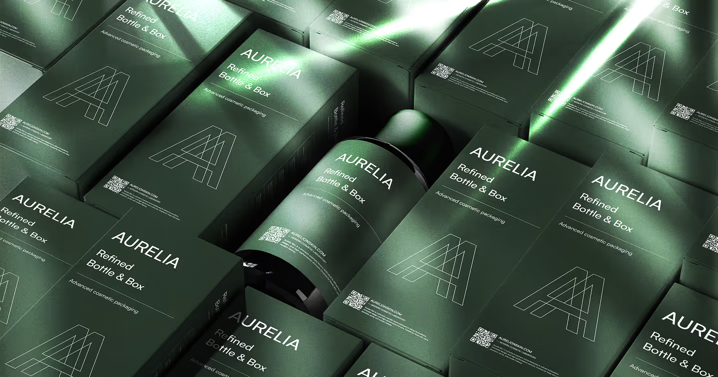
Green connects immediately to nature and growth. Superside's analysis of color branding notes that lighter greens are strongly associated with nature, freshness, and calm. This makes green particularly effective for organic food brands, health and wellness companies, and any business that wants to signal environmental responsibility. It also works well for financial brands wanting to convey prosperity and forward momentum.
Orange and Yellow: Energy and Optimism
Warm colors like orange and yellow generate feelings of happiness, energy, and accessibility. Fast food chains rely on them because they communicate speed and cheerfulness. HubSpot's research confirms that warm colors evoke emotions ranging from warmth to excitement. In retail and consumer contexts, these colors lower psychological barriers and make brands feel approachable and fun rather than intimidating or exclusive.
Purple: Creativity and Premium Quality
Purple has long carried associations with luxury, creativity, and wisdom. Brands in the beauty, confectionery, and premium retail space often use it to signal elevated quality without the coldness of black. Cadbury's distinctive purple is one of the most recognized examples of a color becoming inseparable from a brand's identity over decades of consistent use.
Black and White: Authority and Clarity
Black communicates authority, sophistication, and premium positioning. Many luxury fashion and technology brands use it to create a sense of exclusivity. White signals cleanliness, simplicity, and openness. In digital design especially, generous white space paired with minimal color creates a sense of quality that cluttered, colorful layouts rarely achieve. The two often work best in combination, each amplifying what the other conveys.
The Gender Factor in Color Psychology
Color preferences vary meaningfully by gender, and ignoring this can result in a brand that resonates with only part of its intended audience.
Help Scout's research reveals that men generally prefer bold colors, and are more likely to favor shades (colors with black added), while women tend to prefer softer tints (colors with white added). A brand targeting professional men tends to perform better with bold, saturated color schemes. A brand focused on women often resonates more with softer, lighter variations of the same hue.
This doesn't mean rigid gender-based color assignment. It means understanding your specific audience's psychological relationship with color and using that understanding to inform choices rather than ignoring it entirely in favor of aesthetic preference.
Brand Recognition Through Consistent Color
Consistent color use is one of the most cost-effective brand-building investments a business can make. Recognition built through repetition compounds over time into an asset that's very difficult for competitors to replicate.
Digital Silk reports that a signature color scheme can increase brand recognition by as much as 80%. Coca-Cola's red and white, McDonald's yellow arches, and Tiffany's iconic blue are all examples of color doing the work of recall without any other brand signals needing to be present.
This is exactly why the work we do at Wauu! Creative extends beyond picking attractive colors. We build comprehensive color systems that function across every touchpoint: website, business cards, social media, printed materials, and product packaging. You can see this approach in action in our logo and branding work, and in projects like Greatpoint, where every color choice was made with their specific audience and business goals guiding the decision. For a deeper look at how we develop those systems step by step, our post on our branding design process walks through the full methodology.
Color in Context: Why Isolation Is a Mistake
Color never exists in isolation on a page or in a brand system. The context, combinations, and consistency of use determine whether a color strategy actually works.
WordStream's analysis emphasizes that successful brands maintain color consistency across everything. When Dunkin' rebranded from Dunkin' Donuts to just Dunkin', they changed almost everything except their iconic orange, pink, and brown color scheme, because that combination was doing too much brand-recognition work to risk disrupting.
Color combinations matter as much as individual color choices. A blue and gold pairing signals premium professional quality. A black and neon combination suggests boldness and disruption. Pastels together signal approachability and calm. Each combination produces a different total effect from the sum of its parts.
In UI/UX design, color context is particularly critical. The same color can accelerate a purchase decision on a product page and create anxiety on a checkout page depending on where and how it's applied. Color in digital interfaces affects not just brand perception but actual user behavior, click-through rates, and conversion. We explore the specific ways poor color choices erode trust in our article on common visual mistakes that kill trust.
Color Psychology Applied to Digital Design and Conversion
In digital contexts, color choices directly affect conversion rates. CTA button color, form field design, error state styling, and the color hierarchy of a landing page all influence whether a user completes an action or abandons it.
Red and orange CTAs consistently outperform green and blue ones in A/B tests on many e-commerce and SaaS sites, because they create a sense of urgency and immediacy. But context matters. On a finance or healthcare site where trust is the primary conversion driver, a red CTA can feel alarming rather than motivating. The right color for a button is the one that fits the emotional register the rest of the page has established.
Contrast is equally important. A CTA button that doesn't visually stand out from its surroundings won't be clicked regardless of its color. This is one of the intersections between color psychology and accessibility: sufficient contrast between interactive elements and their backgrounds improves both conversion rates and WCAG compliance simultaneously. We cover the accessibility dimension of this in our article on why accessibility is just good UX.
Putting Color Psychology to Work for Your Brand
Effective color strategy starts with behavior, not aesthetics. The first question isn't what color looks good. It's what behavior you want to encourage and what emotion needs to underpin that behavior.
If you're running an e-commerce site and want to drive quick purchase decisions, strategic use of red or orange in call-to-action elements can help. If you're a financial or professional services brand that needs to build confidence before a conversion, blue-dominant design supports that. If your brand positioning centers on health, sustainability, or nature, green communicates that positioning before a visitor reads a single line of copy.
Color is one piece of a larger puzzle. As Marion's guide to brand colors emphasizes, the right color must align with your overall brand strategy and customer experience to produce its intended effect. Applying a trust-building color to a visually chaotic layout doesn't build trust. It creates dissonance. The color has to work with the structure, typography, imagery, and messaging around it.
At Wauu! Creative, we approach color as part of our comprehensive branding and design process. We consider your target audience, business goals, competitive landscape, and the specific behaviors you want to encourage before a single color is chosen. Whether that's a complete rebrand through our creative design services or a new website build, color psychology informs every decision. For brands thinking about updating an existing identity, our article on what makes a visual identity stand out covers how color fits into the broader system.
Frequently Asked Questions
How does color affect buying behavior?
Color influences buying behavior by triggering emotional responses that shape purchasing decisions before conscious reasoning takes over. Red creates urgency and drives impulse purchases. Blue builds trust and encourages deliberate buying. Green signals health and calm. Orange and yellow create energy and approachability. These associations are consistent across consumer research and purchasing data.
What color increases sales the most?
There's no single universally best color for sales. Red and orange tend to drive urgency and impulse purchases in retail and e-commerce contexts. Blue supports trust-based conversions in financial, legal, and technology services. The most effective color is the one that matches the emotional response your specific audience needs to feel in order to take action.
How much does color affect brand recognition?
Significantly. Research shows a signature color scheme can increase brand recognition by up to 80%. Color becomes one of the fastest-processed signals in brand recall, often triggering brand association before a logo, name, or tagline is consciously registered.
Should I follow color psychology rules strictly?
Use them as a starting point, not a rigid formula. Color psychology describes tendencies and associations observed across large populations, but your specific audience, cultural context, and competitive landscape all influence what works for your brand. The rules give you informed defaults. Testing and observation tell you what actually performs.
Can the wrong color choice hurt my brand?
Yes. A color mismatch between your brand personality and your visual identity creates a sense of wrongness that users feel even if they can't articulate it. It can undermine trust, confuse positioning, and make an otherwise good brand experience feel off. Getting color right is much cheaper at the start of a project than correcting it after a brand has been established in the market.
Your customers are making split-second judgments about your brand based on color before they read a single word. Make sure those judgments work in your favor. If you're ready to build a color strategy that drives the behavior you want to see, let's talk.