Blackstone Cap: A full rebrand
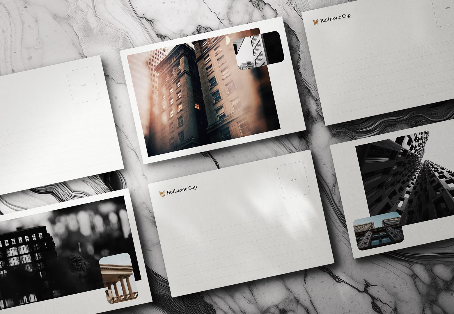
A full rebrand for Bullstone Cap, a New York real estate investment firm, plus a refresh of their Squarespace site to match.

Introduction
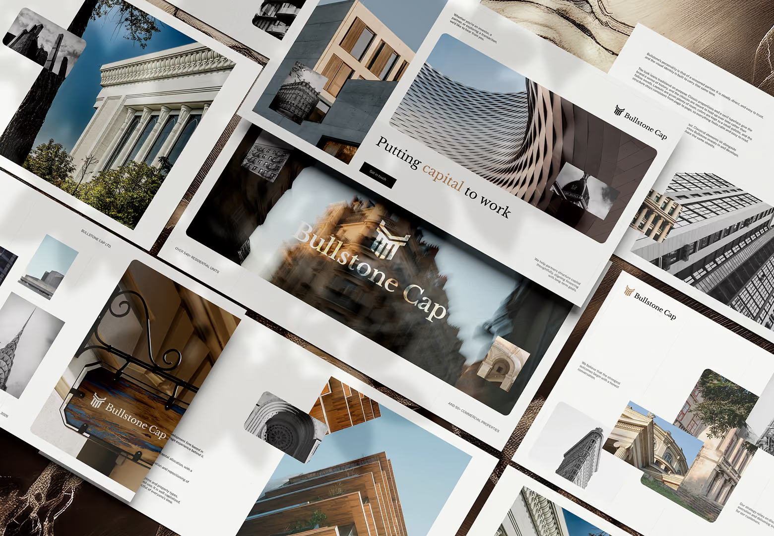
Bullstone Cap is a real estate investment firm based in Manlius, New York, founded by Troy Bullock and Michele Damico. They buy, improve and develop multifamily, industrial and retail properties across the Northeast, Southeast and Midwest of the US, and they also run a commercial brokerage. The name says a lot about how they work: the bull stands for strength and conviction, the stone for permanence and integrity. Bullstone Cap is our third client in the US.
A logo that undersold the firm
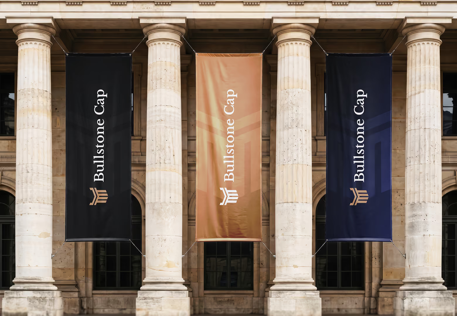
Bullstone's logo had been made with AI, and it didn't match a firm with more than 150 commercial transactions and 30 years of brokerage experience behind it. In real estate investment, sellers, investors and brokers decide quickly whether a firm feels credible, and the brand is often the first thing they see.
Troy and Michele originally came to us for a new logo. As the work went on, they trusted us with more, and the project grew into a full rebrand.
From a new logo to a full rebrand
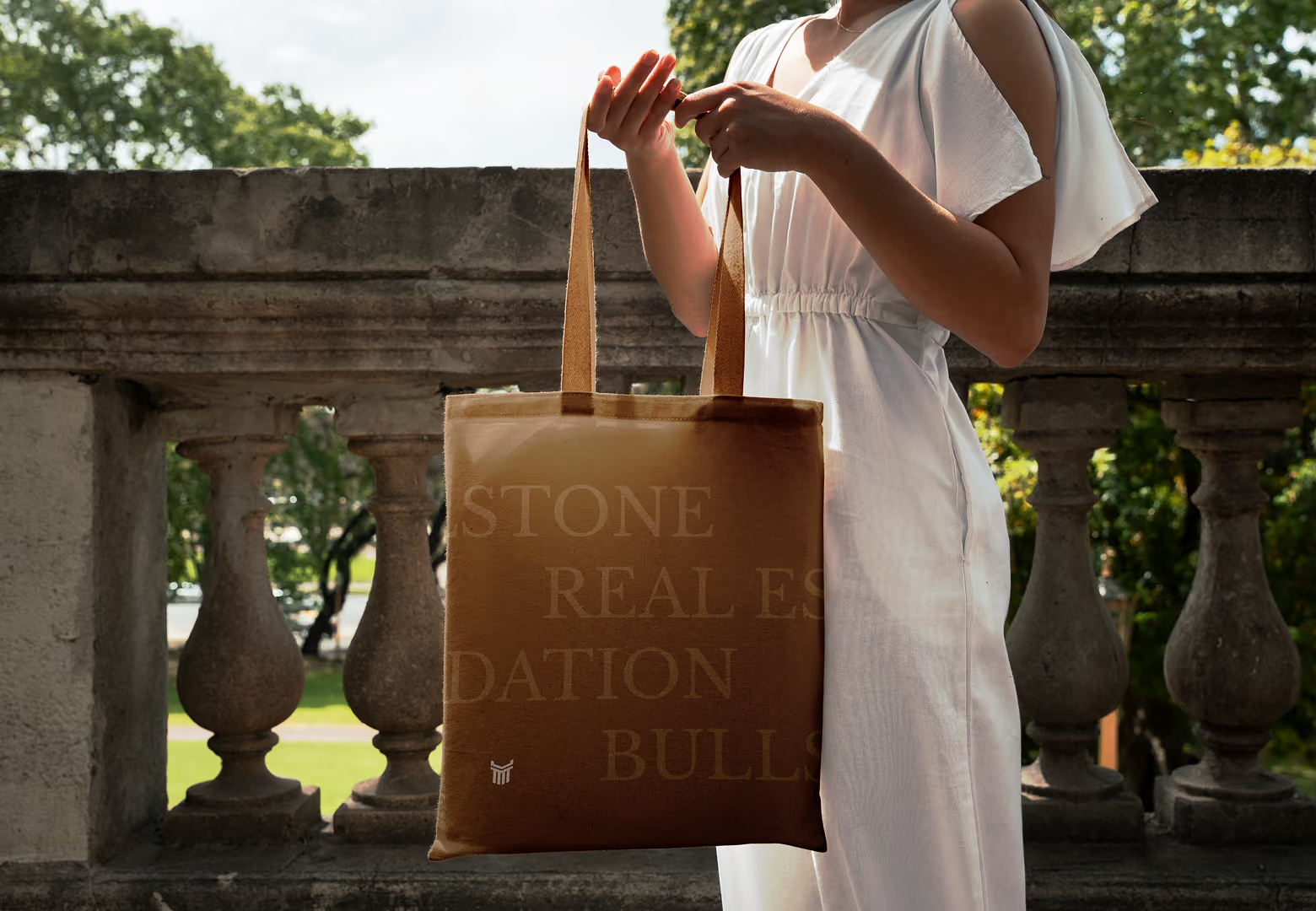
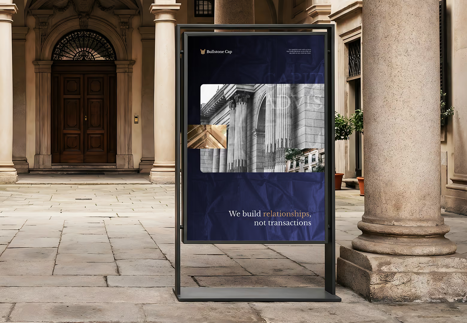
We followed the same process as in our other branding projects. We designed three logo concepts and presented them as a brand pitch, showing each logo in three different directions. Troy and Michele chose their favourite, and we built the rest of the brand around it.
The rebrand included:
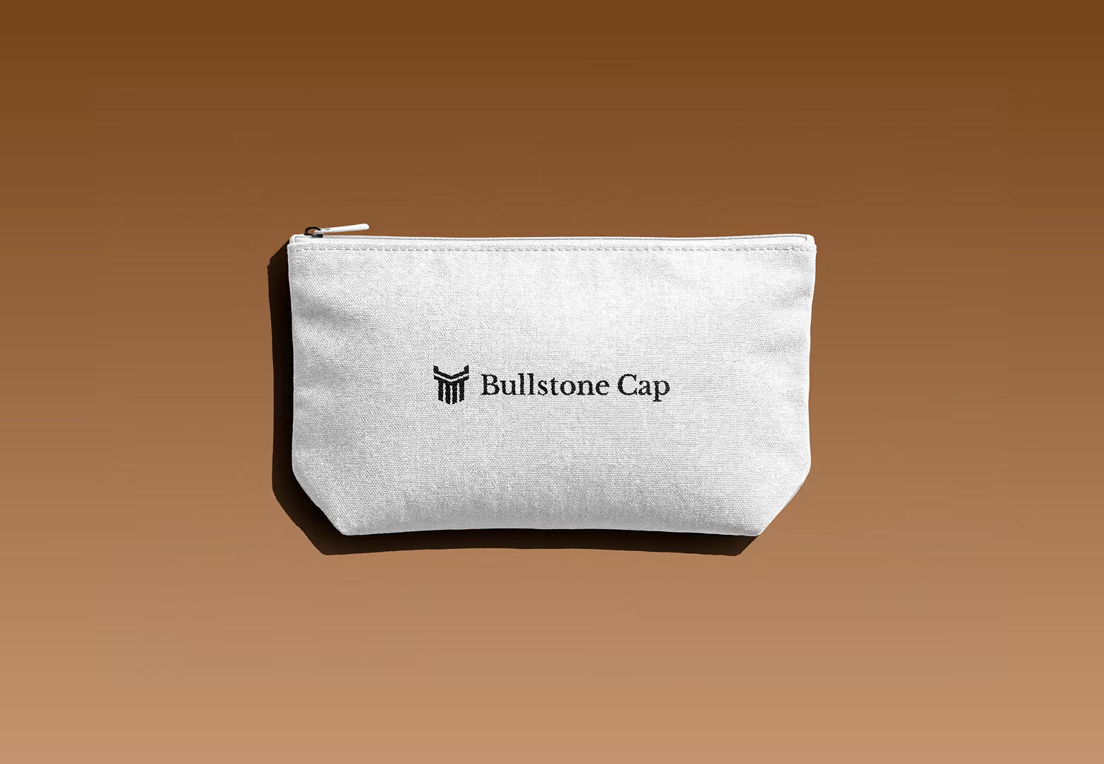
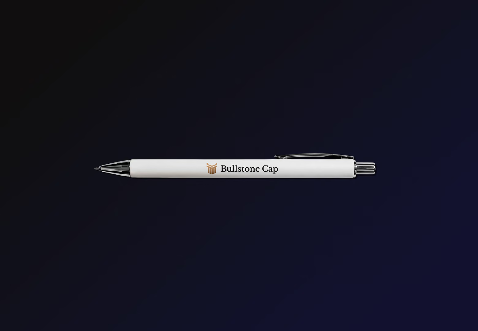
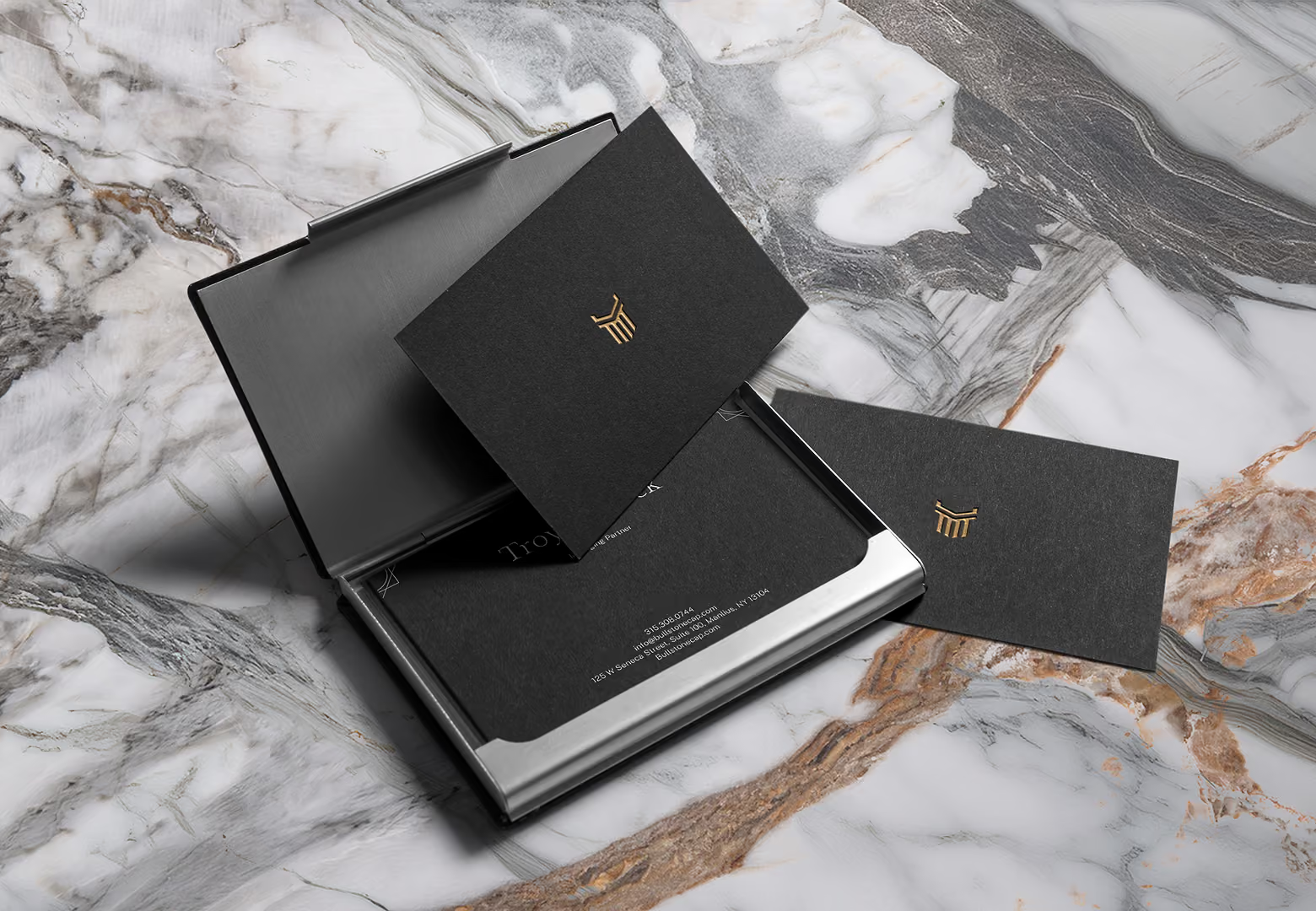
- a new logo
- a colour palette
- a brand guideline, so the brand is used the same way everywhere
We didn't rebuild their website. Instead, we cleaned up their existing Squarespace site so it matches the new brand. We also ran a light audit of the site, fixed SEO issues and repaired broken URLs.
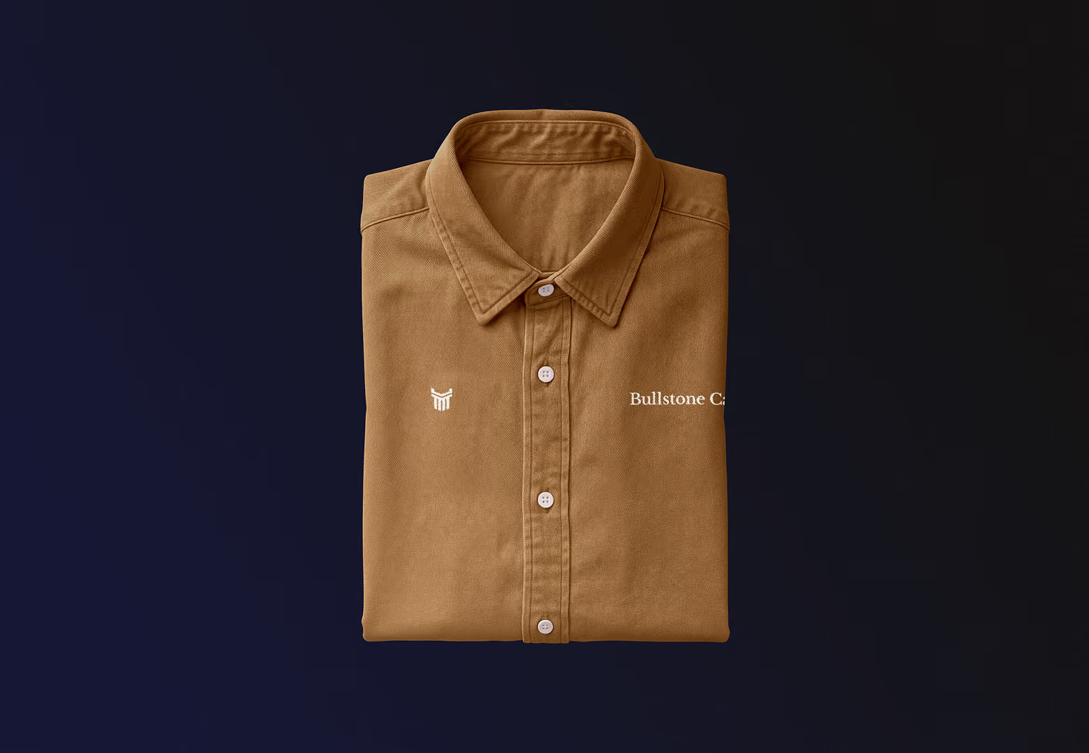
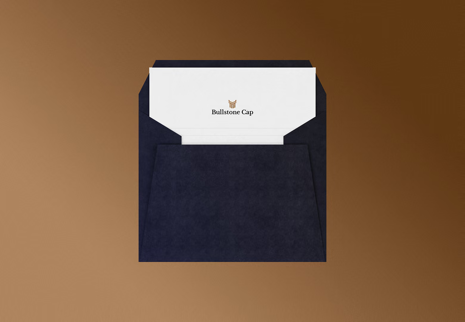
Strong, modern and built to last
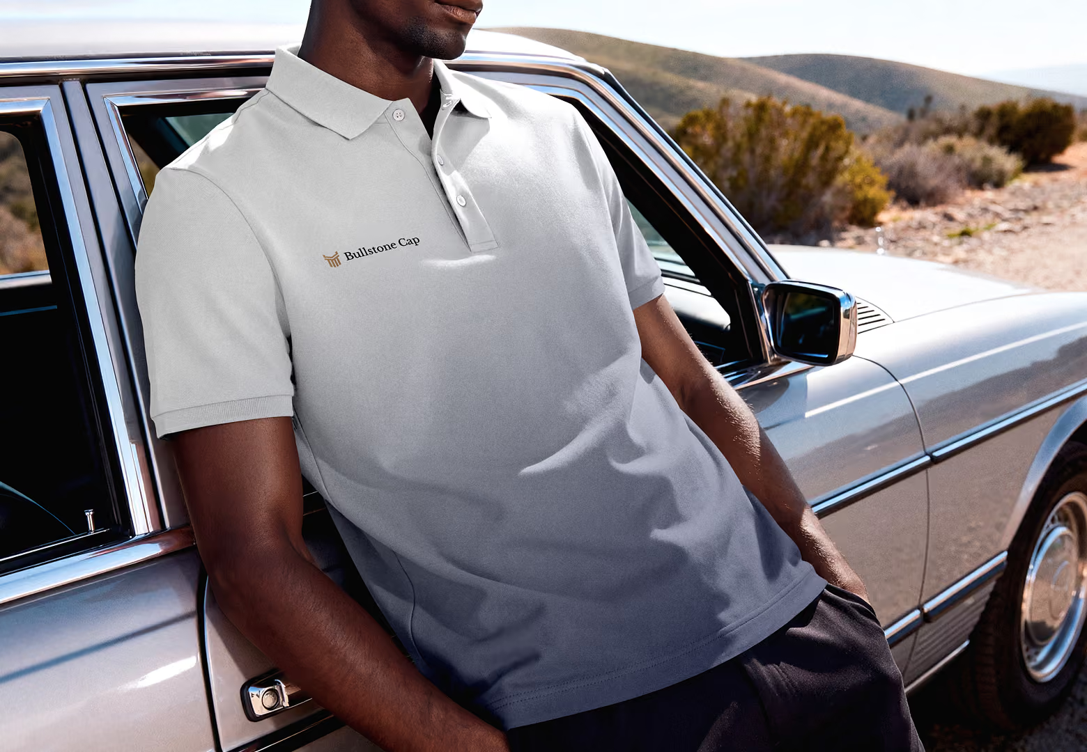
Bullstone Cap now has a strong, modern brand that fits the business and builds trust with sellers, investors and brokers. Their website looks like it belongs to the same company, and the fixes behind the scenes make it easier for people to find. Troy and Michele were really happy with the result.