Introduction
Forceo is a Finnish company building an AI partner for one person: the CEO of a growing company. It learns the company's data, strategy and goals, so CEOs get clear answers and reports without having to teach an AI tool their business from scratch. Forceo starts with a one-week analysis of where the company stands, then helps put the findings into practice in leadership, growth and profitability.
A new name and nothing else yet
Hiski Kaikkonen and Markku Pulkkinen already ran a business called Growpetence. They saw a bigger opportunity in an AI tool made just for CEOs, so they decided to change the product and the service and start again under a new name: Forceo.
When they came to us, the name was all they had. No logo, no colours, no visual identity, nothing to put in front of the CEOs they wanted to reach. And that audience is hard to win over. A CEO who trusts a company with their data, strategy and plans needs to see from the first look that it's a serious business, not another AI experiment.
Three directions, one clear choice
We worked the same way as on our other branding projects. We designed three logo concepts and presented them as a brand pitch, showing each logo in three different directions. Hiski and Markku picked the strongest one, and we built the full brand around it.
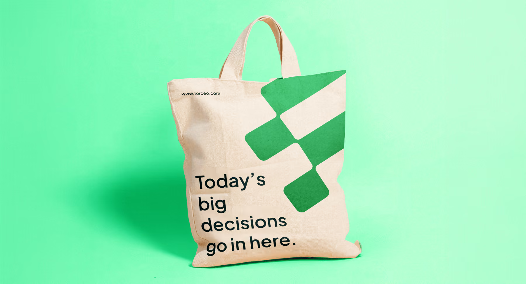
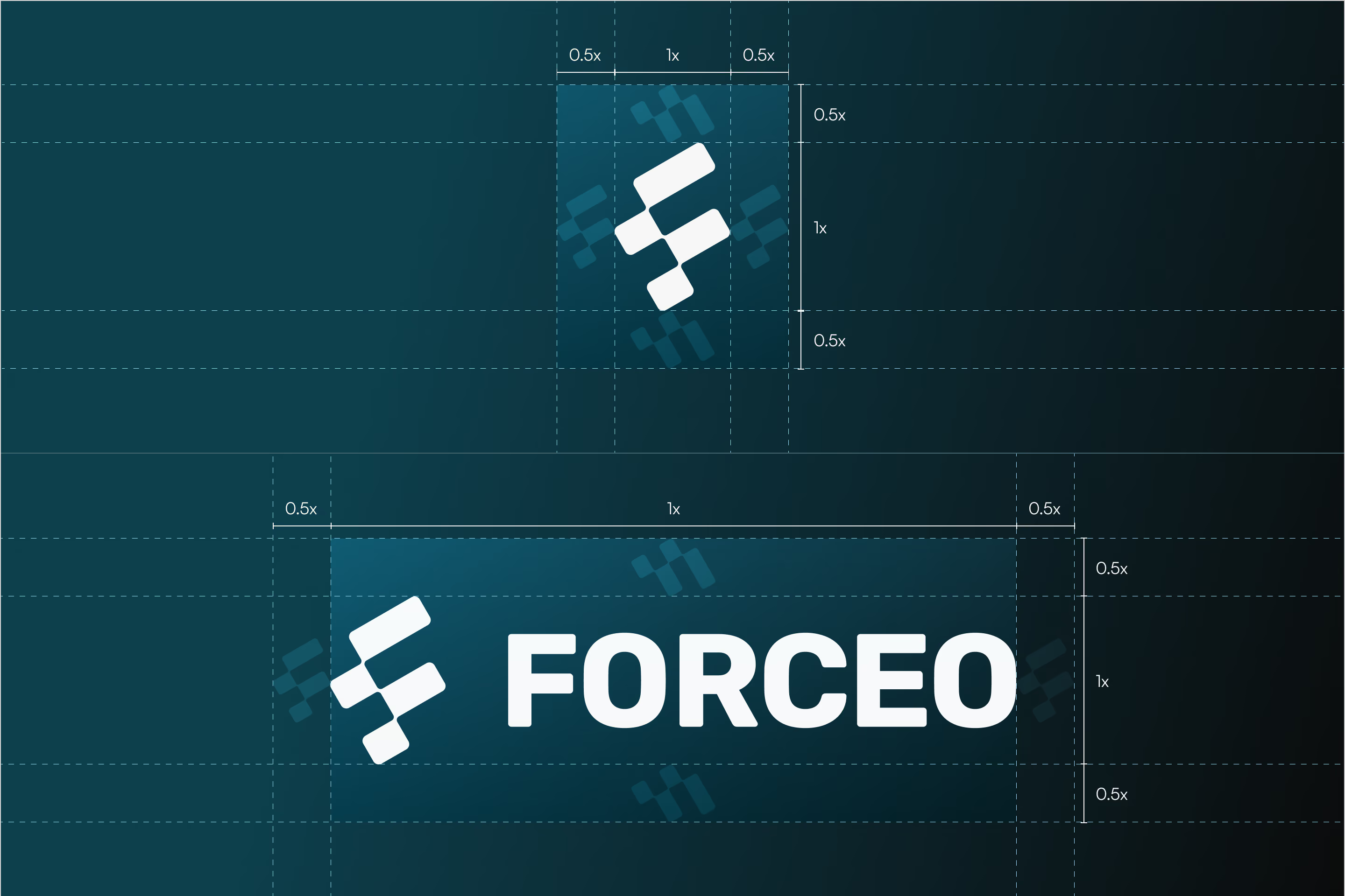
The logomark is a tilted letter F made from rounded blocks. The blocks also read as a bar chart, which ties the mark to what Forceo does: turning a company's data into a clear picture for the CEO. The tilt follows a 30° grid and gives the mark a sense of direction and growth.
The full brand package includes:
- a primary logo, horizontal and vertical versions and a standalone logomark
- a colour palette built on dark teal and green, with mint, frosted blue and beige as supporting colours, plus gradients
- typography in Plus Jakarta Sans with a clear type hierarchy
- a graphic pattern, guidelines for photos and icons, and a tone of voice
- templates for social media posts, page banners and slide decks
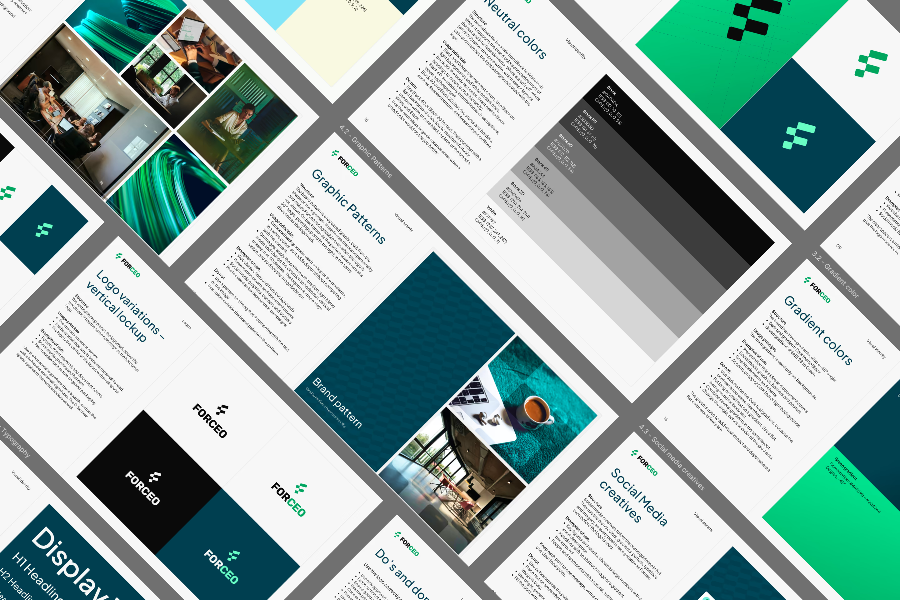
- a brand guideline that brings it all together
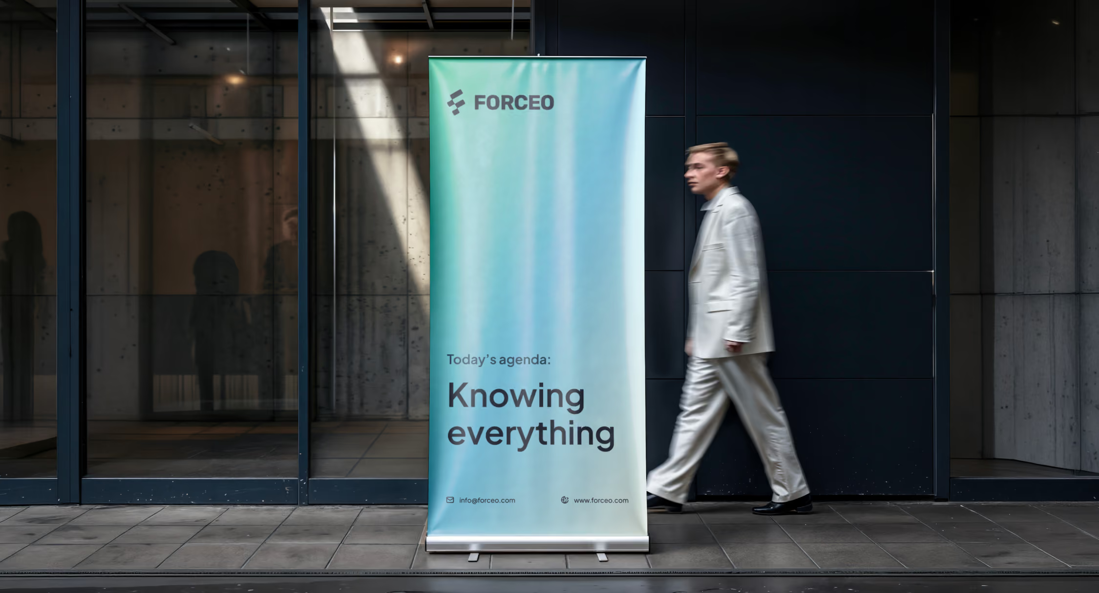
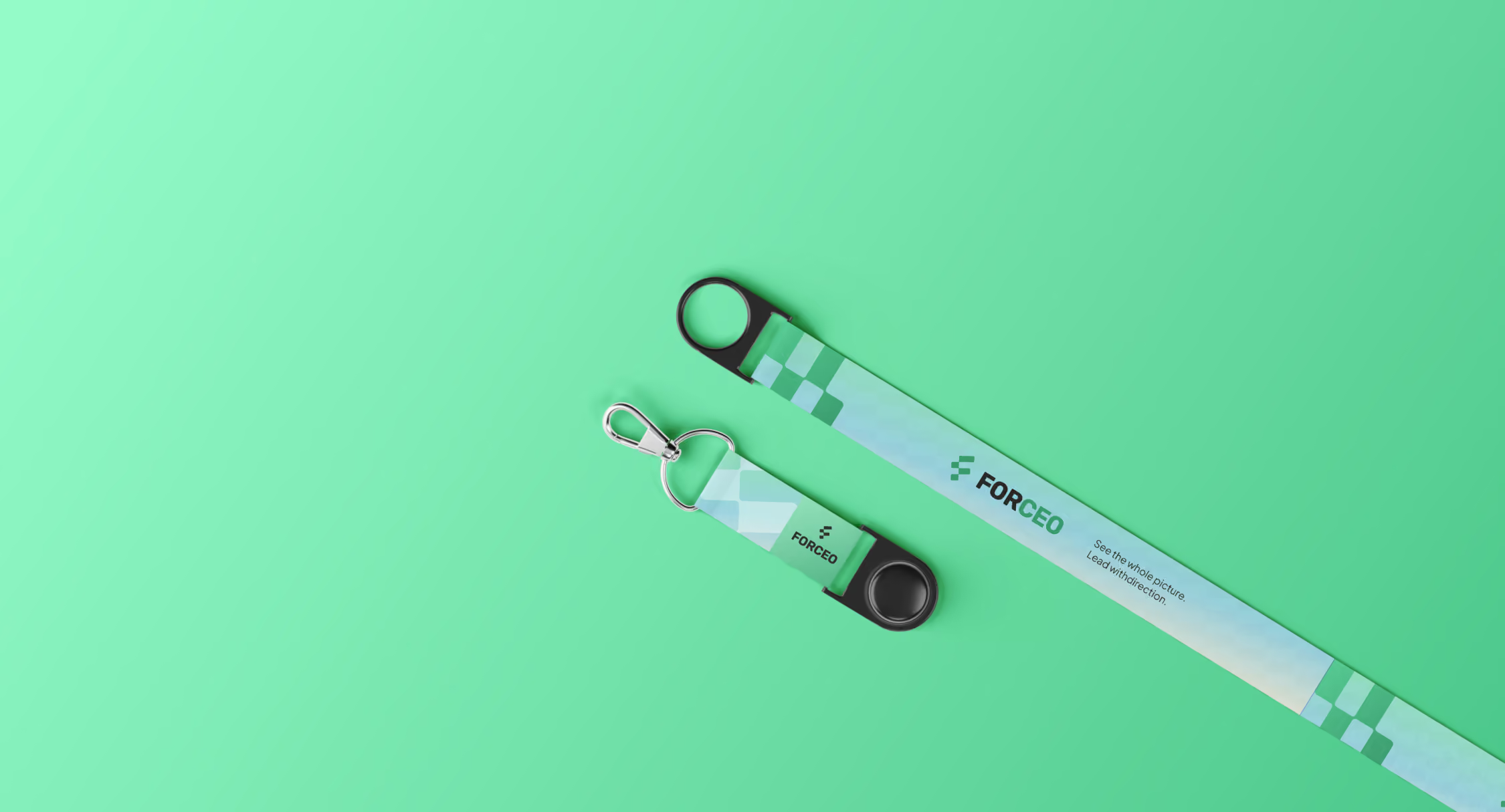
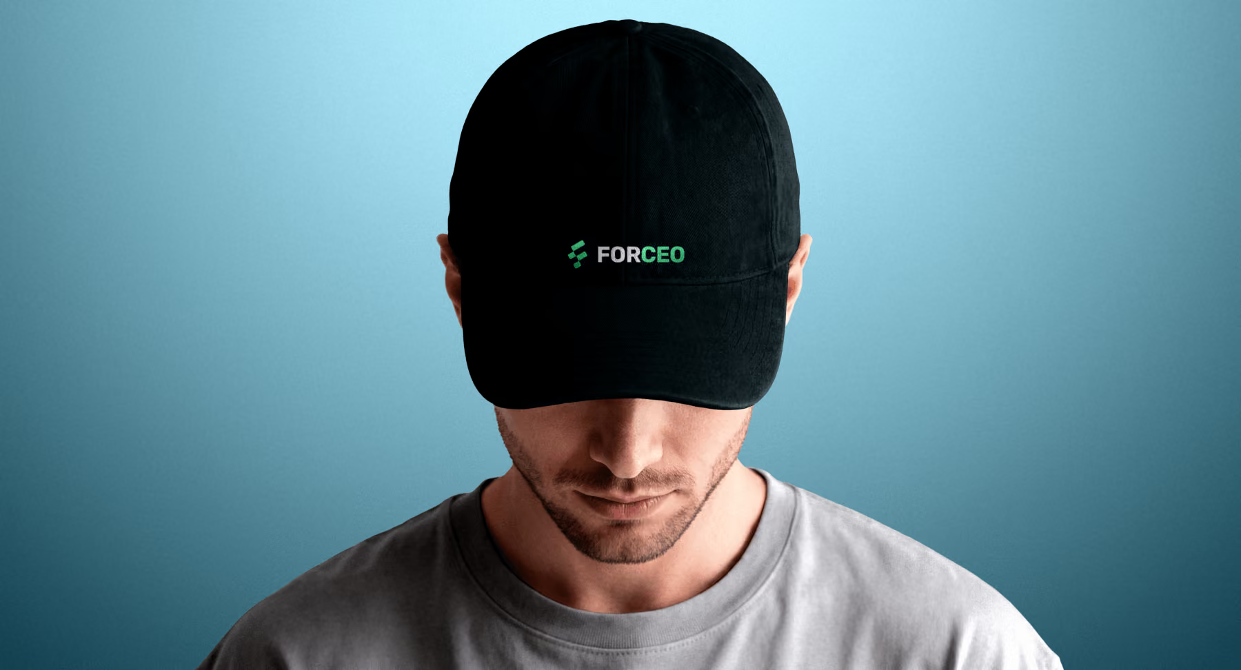
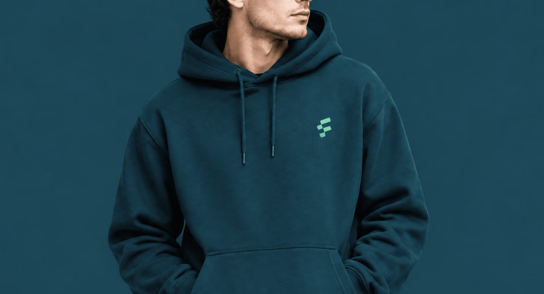
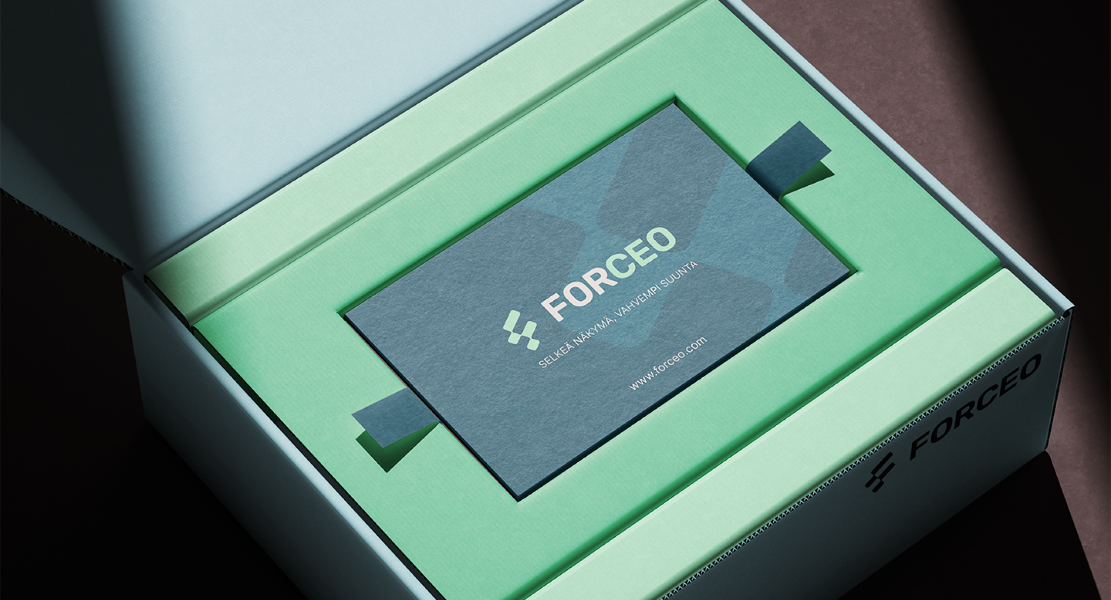
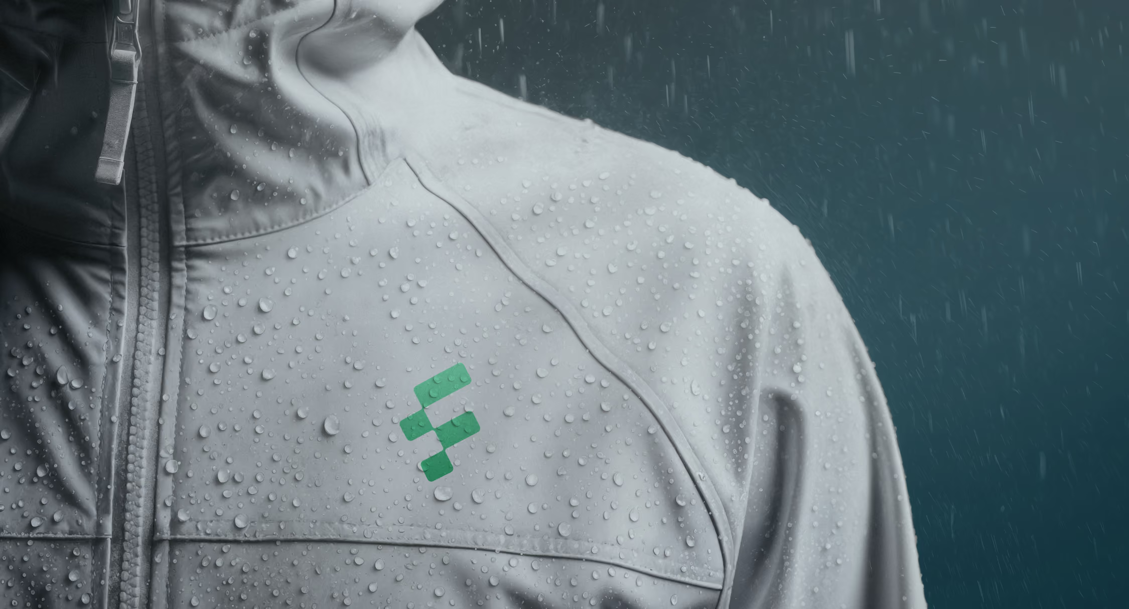
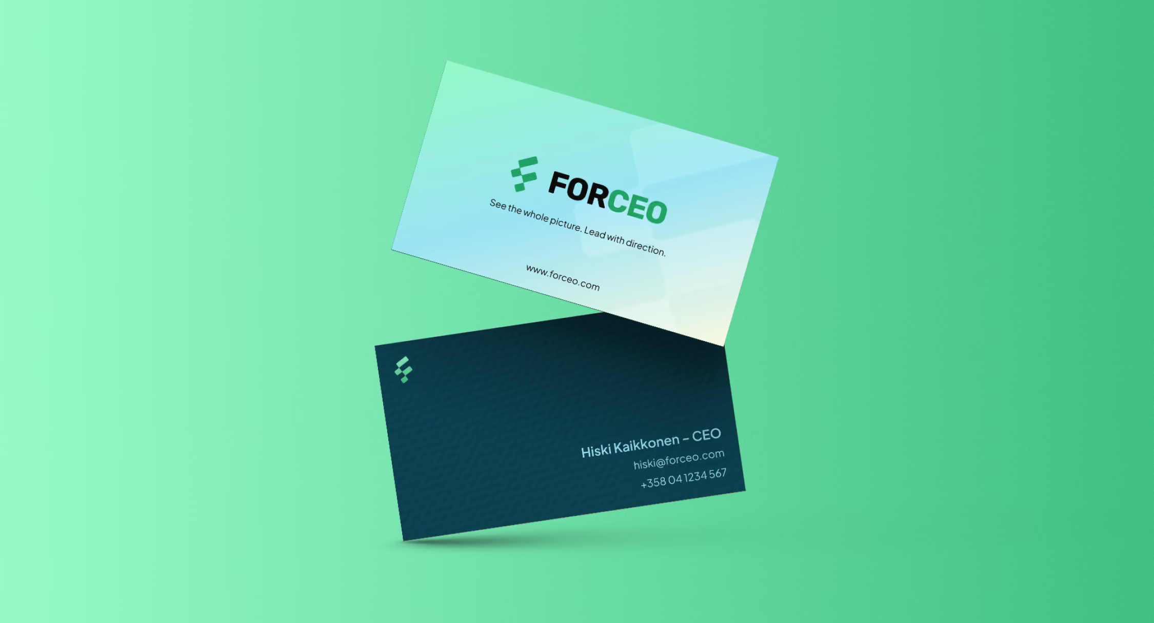
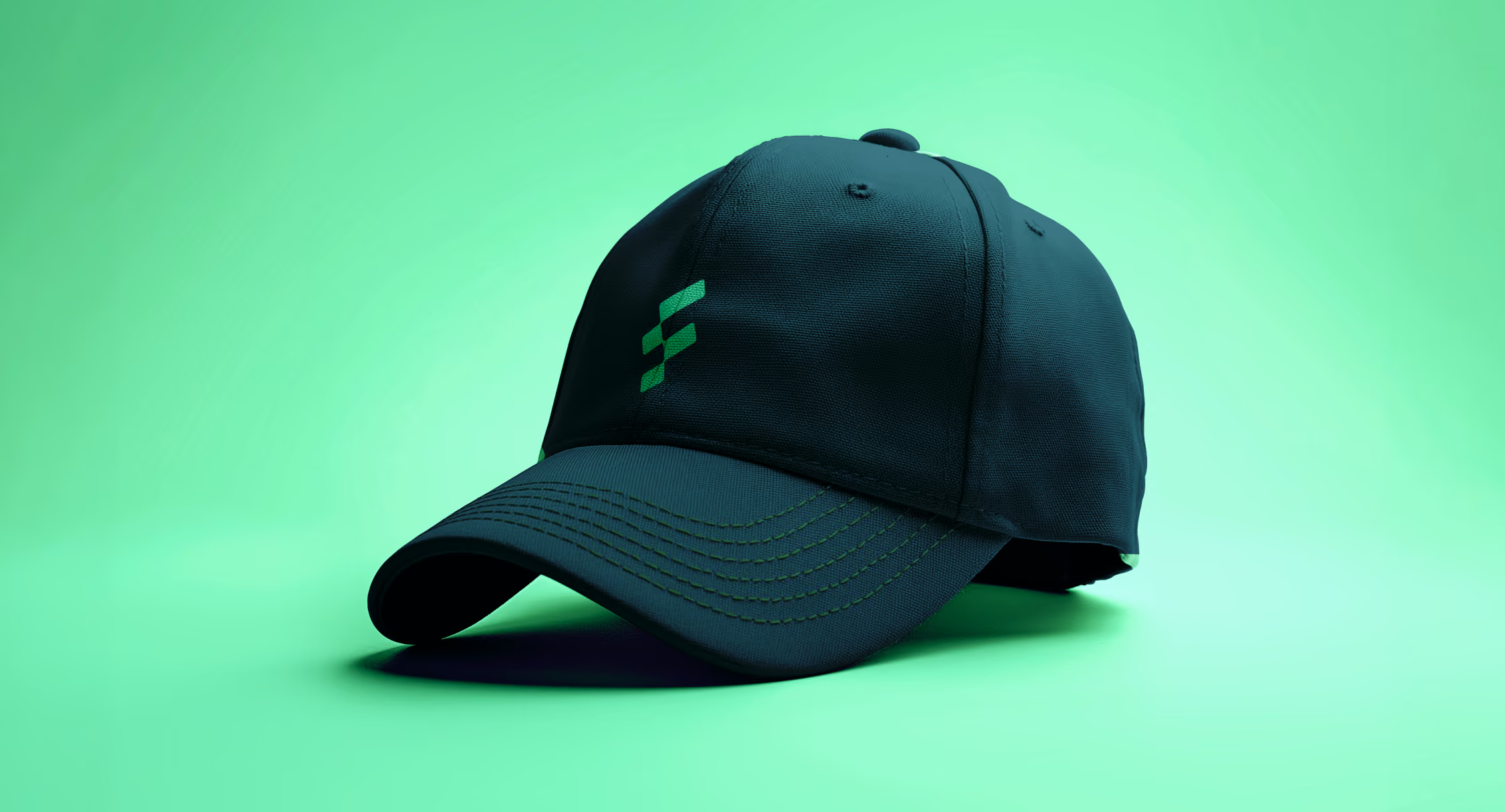
We also made mockups showing the brand in use: roll-up banners, flyers, billboards, business cards, packaging and merch like caps, hoodies, tote bags and lanyards.
Everyone was busy, so most of the work happened over email. A couple of meetings helped us understand their vision and settle the bigger questions.
Easy to approach, serious enough for CEOs
Forceo now has a complete brand that stands out from its competitors. The friendly colour palette makes the company easy to approach, while the overall look stays professional enough for CEOs to take it seriously.
With the brand guideline and ready-made templates, Forceo's social posts, presentations and marketing material look consistent from day one. When it's time for the website, the foundations are already in place.