CIMB
Redesigning CIMB Singapore's online account opening so it feels simple and safe, within strict banking rules.

Introduction
CIMB is one of ASEAN's leading banks, with a growing digital presence in Singapore. They wanted to redesign their whole online onboarding flow. The brief was to make opening a bank account online feel easy and trustworthy, while staying within Singapore's strict financial regulations and the bank's enterprise design system.

A high-stakes flow full of friction
Opening a bank account is demanding. People have to read product terms, hand over sensitive personal and ID details, pass KYC checks and trust a screen with information they'd normally give in person. For many, especially those less confident online, it's too much at once, and they give up.
On top of that, Singapore's financial sector is tightly regulated. Mandatory disclosures, KYC and AML requirements and audit-ready consent steps couldn't be hidden or watered down. Everything also had to be built with the Backbase Design System, a solid but strict enterprise toolkit that leaves little room to do things differently.
So the design had to balance three things pulling in different directions:
- strict regulation
- a good user experience
- the drop-off risk that grows with every extra screen
One task per screen, with help where it's needed
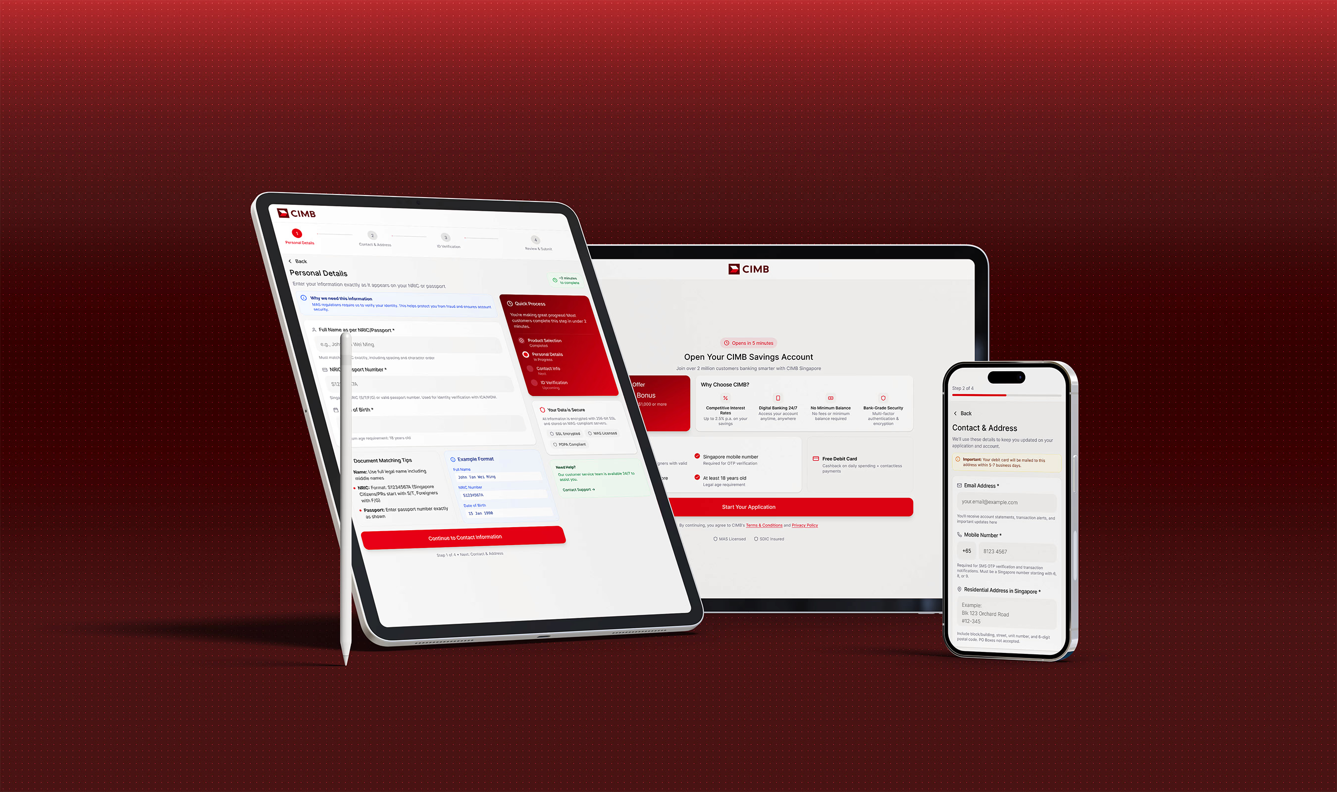
The guiding idea was that every step should feel manageable. We restructured the journey into a clear sequence of product information, personal details, identity verification, then review and submit. Each screen has one main task, so users always know what comes next.
For compliance content we used progressive disclosure. Legal text and secondary information are always available but visually quieter, and they open up when someone needs them. Helper text and tooltips explain the trickier fields without cluttering the screen. The flow meets every regulatory requirement without feeling like a checklist.
We built the forms with Backbase's native components. Validation works the same everywhere, interactions are accessible, and inline errors tell people how to fix a mistake instead of just flagging it. Microcopy did a lot of the work on trust: plain sentences explaining why each piece of information is needed, especially at the sensitive steps.
Accessibility was a must. Contrast, focus states, touch targets and type hierarchy all meet enterprise standards, so the flow works for everyone on any device.
A flow that meets the rules and is easier to finish
The exact numbers are confidential, but the difference is clear. The flow is more guided and less intimidating, forms are easier to complete, and users feel more confident at the most sensitive steps. Compliance stayed intact throughout, without making the experience worse.
The bank also got a scalable onboarding structure. Because it's built from systemised Backbase components, new products, regulatory changes and backend integrations can be added with little rework. Good UX and strict compliance can work together, and this project shows it.