Urakointiplus: rebranding and webflow development
A new website and SEO content for Urakointi+, Finnish software that lets contractors run their whole business in one place instead of a dozen spreadsheets and apps.

Introduction
Urakointi+ helps Finnish contractors stop juggling separate tools, with one system that takes them from quote to invoice. We redesigned their website and rewrote their content so the right people get that value quickly. They were also our first SaaS client.
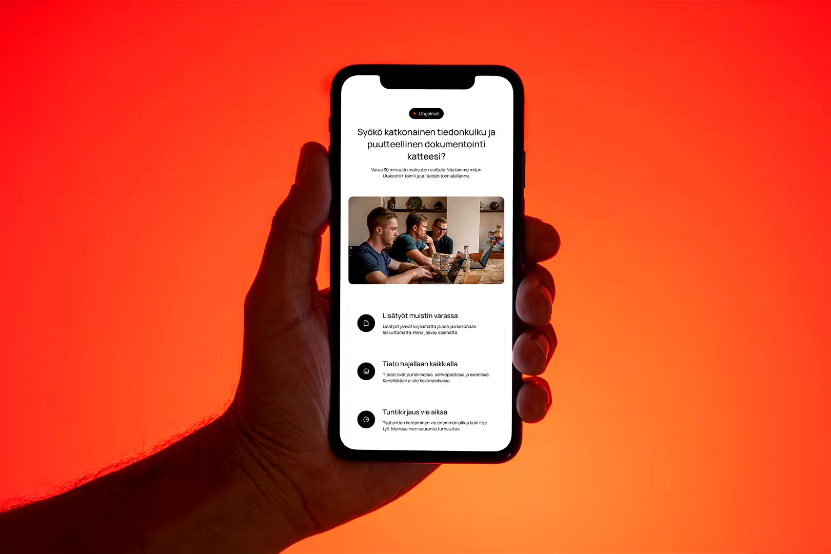
Too many tools on the toolbelt
Urakointi+ had a really useful product: a customisable management system that lets Finnish contractors run their whole operation from one platform. The website wasn't getting that across.
First, the messaging. Visitors couldn't tell what Urakointi+ did or how it differed from other management software. The value was buried, and the language didn't sound like the contractors it was written for.
Second, the structure. Nothing guided visitors towards booking a demo or getting in touch. There were some trade pages for glaziers, roofers and others, but they were thin and inconsistent. They did little to convince a sceptical contractor that the system fit their trade.
Third, the look. The site felt dated. When you ask businesses to trust you with all their operational data, looking unpolished hurts your credibility. In a niche B2B market where people don't buy on impulse, first impressions carry a lot of weight.


A site that speaks each trade's language
We treated this as a full redesign, not a visual refresh. The site had to do real sales work: bring in the right visitors, explain the product clearly and turn interest into booked demos.
We started with the messaging. Together with the Urakointi+ team, we changed how the product is presented, leading with contractors' everyday problems instead of software features. The language is direct and trade-specific, so a roofer or an earthworks contractor feels the site was made for them.
Next came the industry pages. Each target trade got its own page with tailored copy, relevant use cases and a clear call to action:
- glaziers
- land construction companies
- fire stopping specialists
- refrigeration service companies
- general contractors
These aren't the same page with a different logo. Each one is written around the frustrations that trade deals with every day.
We rebuilt the site structure around one path, from understanding the product to booking a meeting, so every page has a clear purpose and next step. We also researched Finnish keywords for each trade and worked them naturally into the copy. That way Urakointi+ can grow its organic traffic from the searches that matter.



A site that works like the software should
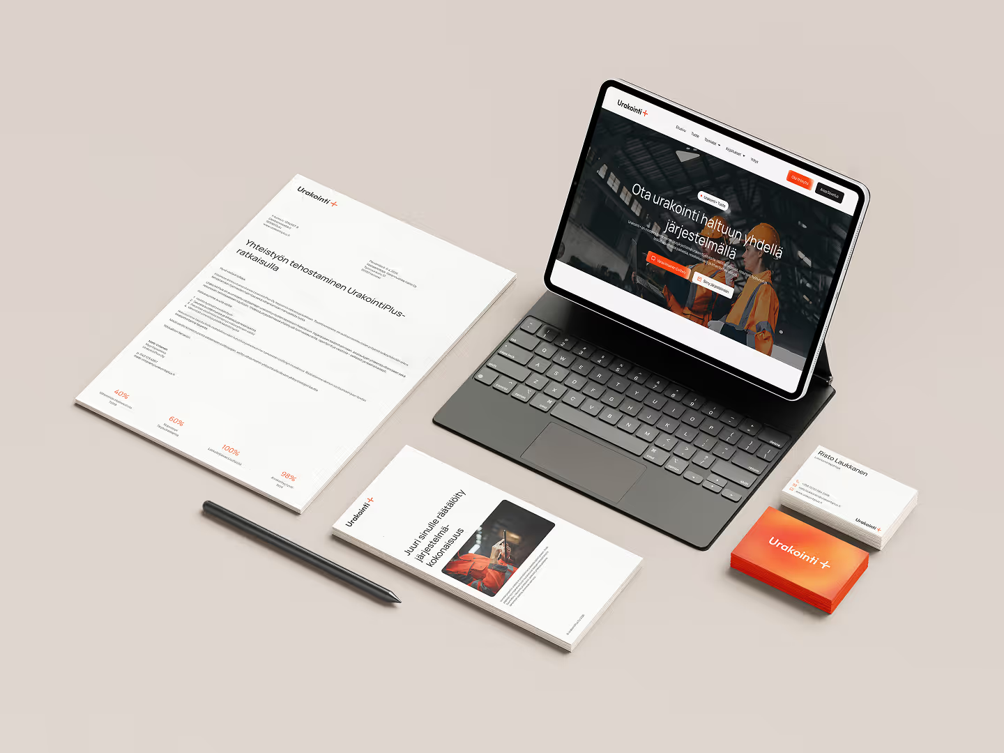
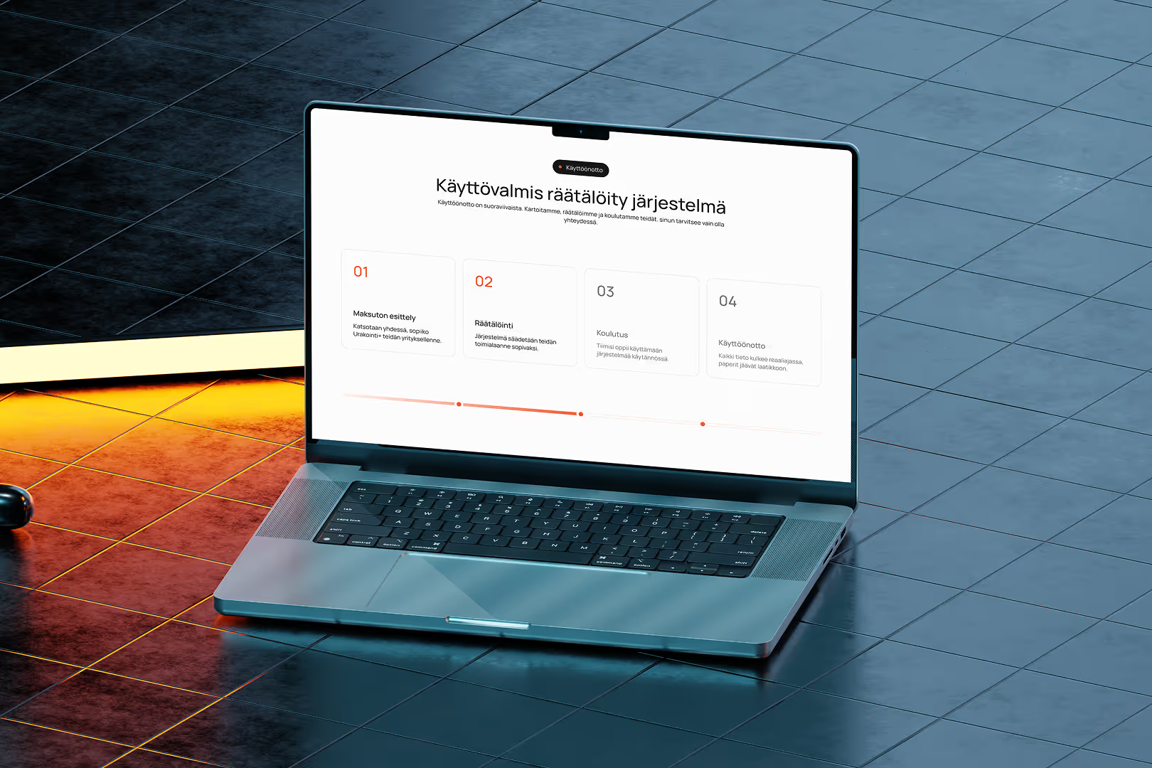
The new Urakointi+ website finally matches the quality of the product. Each trade has its own page that speaks its language, covers its specific problems and gives a clear reason to book a demo. The site also has a proper product page, which the old one was missing.
The messaging is clear and consistent everywhere. From the homepage to the deepest trade page, visitors know what Urakointi+ does, who it's for and what to do next. The dated, patchy feel of the old site is gone. In its place is a modern site that lets a B2B software company compete properly.
The SEO groundwork is in place for every target trade. It's still too early for hard numbers, but the site is now built to rank, which the old one wasn't.
For us, this project was a milestone: our first SaaS client. It showed that our approach works just as well for software as it does for service businesses. That approach is clear messaging, a simple user flow and pages with one clear goal.